CSS basics: change the size, margins and border of an element on your website
In this tutorial, we will explore how to use the width, height, margin and border CSS attributes to style an HTML element. The example code included below will presume we are styling an image with the class "photo". For more information on how to add images to your web pages, refer back to the previous tutorial.
Size
One of the first attributes programmers often look to change about an element is its size. The size of an element can be adjusted by altering its height and width using CSS. For example, we can dictate the exact size of an image using pixels (px); however, setting the size of an element in this way is not particularly flexible and can cause the element to appear misproportioned on certain screen sizes. Instead, it is often beneficial to use a scalable unit of measurement such as '%'. The '%' unit is a percentage value relative to the parent element. For example, if you inserted an image within the body element (and assigned it the 'photo' class), you could then set its width to 50% of the width of the body using the following CSS code:
.photo {
    width: 50%;
}
The size of the body will vary depending on screen size, so setting the width of the image to a fraction of the body width will ensure it scales accordingly.
Other sizing attributes are 'max-height' and 'max-width'. Setting maximum size values will ensure the image never takes up more than a predetermined amount of space on the webpage. For example, if you set the max-height attribute to 400px then the element's height will never stretch beyond 400 pixels.
.photo {
    max-height: 400px;
}
Alternative units you might also wish to consider for your height and width specifications are viewport height (vh) and viewport weight (vw). Each vh and vw represent 1% of the browser window's height and width, respectively. For example, if the browser window was 50 cm wide then 10vw would equal 5 cm. If you wanted to ensure an element never occupies more than 20% of the screen then you could use the following max-height and width values:
.photo {
    max-height: 20vh;
    width: 20vw;
}
Likewise, you can use min-height and min-width attributes to specify a minimum amount of space the element should occupy on the web page.
Margins
Margins create space around an element. You can specify up to four different margin values depending on the overall margin you want to achieve:
- Providing one margin figure (e.g. margin: 10px;) will cause all four margins (top, bottom, left and right) to be the same size (10px in this example).
- Providing two margin figures (e.g. margin: 10px 20px;) will set the top and bottom margins to the first figure (10px) and the left and right margins to the second figure (20px).
- Providing three margin figures (e.g. margin: 10px 20px 5px;) will set the top margin to the first figure (10px), the left and right margins to the second figure (20px) and the bottom margin to the third figure (5px).
- Providing four margin figures (e.g. margin: 10px 20px 5px 30px;) will set the top, right, bottom and left margins to the first, second, third and fourth figures, respectively.
If you wish to declare a value for one margin parameter but not others, then you can specify a single side as follows:
.photo {
    margin-top: 10px;
}
An alternative to declaring specific margin values is to set the margin to 'auto'. A margin value of 'auto' means the element will be positioned as centrally as possible given the constraints of the webpage and parent elements. For example, consider the following code:
.photo {
    width: 60vw;
    margin: 0 auto;
}
This code will cause any image with the class 'photo' to be 60% as wide as the browser window and divide the remaining space on the left and right equally between the photo and other elements on the webpage.
Borders
Borders can be applied to most elements on the webpage including text, images and videos. They are aesthetically useful and can help distinguish an element from its surroundings. A border has three main attributes: thickness, style and colour. Your entry in the CSS stylesheet should look something similar to this:
border: 2px solid black;If you do not want a complete border then you can apply it to select sides only e.g. border-top, border-right, border-bottom and border-left.
There are other ways you can style a border too. For example, you could round the corners by using the 'border-radius' property:
border-radius: 20px;Putting all the above together, we can create a webpage that looks like this:
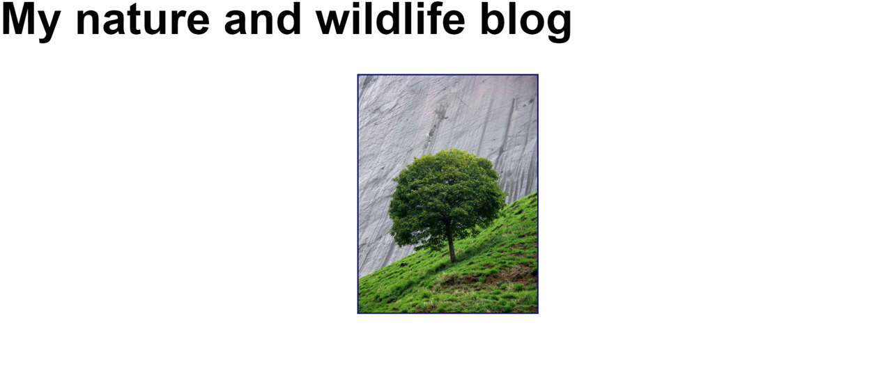
Here is the HTML and CSS code that went into resizing and centrally positioning the tree image and creating a midnight blue border:
<!DOCTYPE html>
<html lang="en-GB">
<head>
    <title>Home</title>
    <meta charset="utf-8">
    <meta name="viewport" content="width=device-width, initial-scale=1.0">
    <link rel="stylesheet" type="text/css" href="main.css">
</head>
<body>
    <h1>My nature and wildlife blog</h1>
    <img src="tree.jpg" alt="Tree" class="photo"/>
</body>
</html>
h1 {
font-size: 4em;
font-family: Helvetica, Times New Roman, sans-serif;
}
.photo {
width: 20%;
max-height: 40%;
margin: 0 40%;
border: 2px solid MidnightBlue;
}