Create polaroid images for your website using HTML and CSS
Polaroids are an attractive way to present images (and their captions) on your website. This tutorial will walk you through how to create the polaroids, style them, and make them functional (e.g. use the polaroids as links).
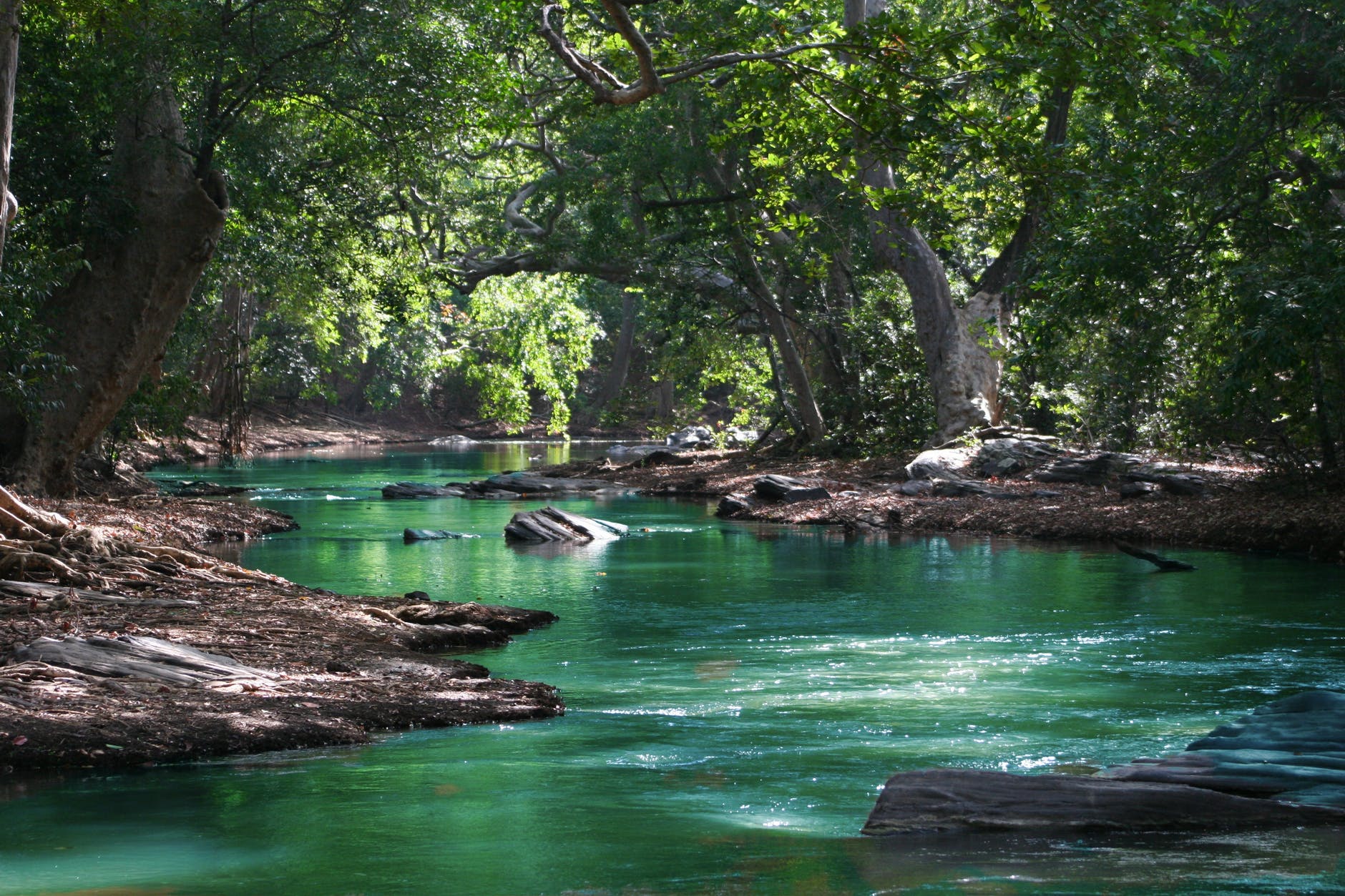
A scenic nature walk
HTML code for a polaroid
The first step when creating a polaroid is to add some opening and closing 'div' tags to your HTML file. Also, assign the opening div tag a class (e.g. 'polaroid'):
<div class="polaroid">
</div>
Inside the div tags, insert the image you wish to use for the polaroid. For this example, we will use an image named 'river.jpeg'.
The HTML code for adding the image to the web page is included below. The code assumes the river image is in the same folder as the HTML file. If you wish to link to images in a parent folder then add ../ before the file location, while if you want to link to an image in a child directory then add the name of the folder followed by a forward slash before the file location e.g. images/river.jpeg. For further guidance on how to format links then see this tutorial.
<img src="river.jpeg">To add a caption to the polaroid, insert a heading below the image. Assign the heading a class (e.g. 'caption') so we can style the caption later:
<div class="polaroid">
    <img src="river.jpeg">
    <h3 class="caption">A scenic nature walk</h3>
</div>
That is the core HTML code required for a polaroid. If you load the webpage now though, the polaroid may not look quite how you expected. This is because the components of our polaroid still need to be styled using your 'main.css' stylesheet.
CSS code for a polaroid
The first component we will style is the polaroid's image. The polaroid image element is a child of a div element with the class 'polaroid', so we can access the image using the CSS selector .polaroid img. Any CSS code applied to the .polaroid img selector will affect the polaroid's image element but not other image elements on the web page.
.polaroid img {
    width: 100%;
    border-radius: 25px 25px 0 0;
    height: 345px;
}
Setting the width to 100% will ensure the image is as wide as the parent element, which in this case is the div element that was assigned the class 'polaroid'. The border-radius configuration used above will round the top left and top right corners of the image. Setting a specific height value is important because it ensures all polaroid images are equal in size.
After styling the image, the next step is to style the polaroid class. The polaroid class is assigned to the div element that acts as a container for the polaroid, so any CSS code applied here will affect the overall appearance of the polaroid:
.polaroid {
    height: auto;
    width: 40%;
    margin: auto;
    background-color: white;
    border-radius: 25px;
    box-shadow: 2px 4px 8px 3px Gainsboro;
}
The above CSS code does the following:
- The height is set to auto to ensure the polaroid will resize automatically and accommodate smaller/larger captions. If you set the height to a specific value (e.g. 700px) then you may notice your caption spilling outside the polaroid (especially when viewed on smaller screens).
- The width determines how wide the polaroid will be. Setting the width to less than 50% leaves space for multiple polaroids to appear side by side.
- Set the margin to auto so any space between the polaroid and other elements is distributed evenly.
- The background-color attribute determines what colour will provide a backdrop to the caption. To see what other colours are available then check out our colour picker
- While we have already applied a border-radius to the polaroid image, declaring the property again here ensures the bottom corners of the polaroid (below the caption) are rounded too. Ideally, the polaroid image element and polaroid class CSS entries will use the same border radius value (e.g. 25px).
- Adding a subtle shadow to the polaroid can help it look more attractive.
With the image and overall polaroid taken care of, the only component left to style is the caption:
.caption {
    padding: 0 20px 20px 20px;
}
Adding padding to the caption is essential. It ensures the caption box will stretch to accommodate the size of the text, thereby preventing lengthy captions from spilling out the polaroid:
A scenic nature walk
Congratulations! You now have learned how to add a polaroid image and caption to your website. The remainder of this tutorial will explore some additional features you might like to incorporate into your polaroids:
Polaroid gallery
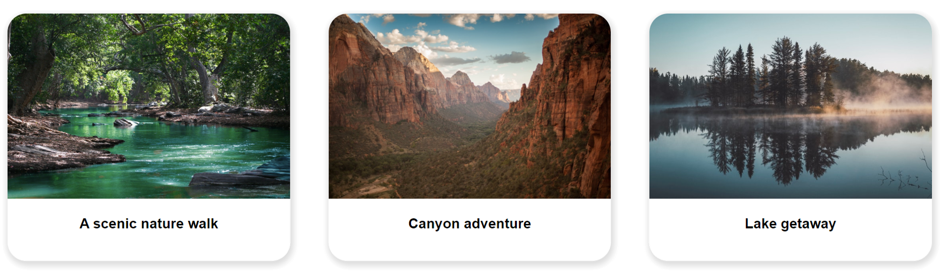
If you are looking to arrange multiple polaroids side-by-side in a photo gallery then the first step is to add the polaroids one after another to the HTML file:
<div class="polaroid">
    <img src="river.jpeg">
    <h3 class="caption">A scenic nature walk</h3>
</div>
<div class="polaroid">
    <img src="canyon.jpeg">
    <h3 class="caption">Canyon adventure</h3>
</div>
<div class="polaroid">
    <img src="lake.jpeg">
    <h3 class="caption">Lake getaway</h3>
</div>
To get the polaroids to arrange themselves neatly in a gallery you will need to add/edit a couple properties of the polaroid class in the CSS stylesheet:
.polaroid {
    height: auto;
    width: 29.3%;
    background-color: white;
    border-radius: 25px;
    box-shadow: 2px 4px 8px 3px Gainsboro;
    margin: 2%;
    float: left;
}
The width property was previously set to 40%; however, if we are going to arrange multiple polaroids side-by-side then we will need to make them a little smaller. Setting the width to 29.3% will allow three polaroids to appear on a single row. If you want more polaroids per row then make the width even smaller. We assign the polaroids a small margin such as 2% to ensure they are spaced out a little and do not cluster together. Finally, we instruct the polaroids to float left so they arrange themselves from left to right on each row.
Responsive (mobile-friendly) polaroids
You may notice your polaroids become 'squashed' when viewed on small devices, especially if you have multiple polaroids arranged side-by-side in a gallery. The solution is to make your polaroids responsive to smaller screen sizes (such as mobile phones) and adjust their size and positioning accordingly. The following CSS code will make the polaroids get bigger and stack one-by-one when viewed on small screens:
@media screen and (max-width: 650px) {
    .polaroid {
        width: 96%;
        margin: 2% auto;
    }
}
The first line of code @media screen and (max-width: 650px) is called a media query. It specifies the screen size at which the CSS code will become effective. In the above example, the CSS code will only apply when the webpage is loaded on browser windows less than 650px wide. When that threshold is reached, the polaroids will become 96% as wide as their parent element (in this case, the parent element is the body element) and apply a vertical margin of 2% and a horizontal margin set to auto. The vertical margin ensures there is a small gap above and below the polaroid, while the horizontal margin evenly distributes any remaining space on the left or right side of the polaroid.
Using the polaroids as links
Polaroids can do more than just look good: they can also act as links to other webpages. Using your polaroids as links is quite easy (especially if you have read our tutorial on creating links). Simply enclose the HTML code for the image and caption inside opening <a> and closing </a> anchor tags. The opening <a> tag will include a href="" attribute which specifies the destination of the link. In the example below, I have created a link to a different page of our imaginary website 'www.treesandtrees.com':
<div class="polaroid">
    <a href="http://treesandtrees.com/nature-walk/"><img src="river.jpeg">
    <h3 class="caption">A scenic nature walk</h3></a>
</div>
Highlighting polaroids when hovered over
This section will cover how to emphasise your polaroids when the user hovers over them with their mouse. It's quite a simple process, simply add the following entry to your CSS stylesheet:
.polaroid:hover {
    box-shadow: 4px 8px 16px 6px Gainsboro;
}
In the above code, we add the :hover selector after the polaroid class. The hover selector ensures the CSS code will only apply when the polaroid is hovered over. We then declare a box-shadow property with larger values than were used previously in the standard '.polaroid' entry. Using larger values means the polaroid's shadow will expand when hovered over. This will help emphasise the polaroid and make the webpage a little more interactive.
For CSS transitions like the box shadow transition described above, it is often advantageous to specify a duration for the transition. Otherwise, the change will occur instantly and will not look very smooth. To ensure all changes to the polaroid class's properties occur over 0.3 seconds, add the following property to the entry for the polaroid class in your CSS stylesheet:
transition: all 0.3s ease;You can see the hover function in action below.