How to create a RecyclerView scrollbar with a draggable thumb and value label
This tutorial will explore how to create a RecyclerView scrollbar from scratch. The scrollbar will feature a draggable thumb, an optional value label, and several customisable properties including colours and sizes. The finished scrollbar is available as a Maven library, and a separate tutorial covers how to use the scrollbar in your Android applications. The purpose of this tutorial is to delve deeper and explore how the scrollbar was built using tools such as custom Views, paint and canvas, and touch and motion events.
The scrollbar's customisable properties
Several properties of the scrollbar are customisable. For example, developers can change the colour and size of various scrollbar components. All customisable properties are defined in an attributes resource file. To create the resource file, right-click the values directory (Project > res > values) then select New > Values Resource File.
Name the file attrs then press OK to create a new resource file called attrs.xml. In the attrs.xml file, add the following code to define the scrollbar's customisable properties:
<?xml version="1.0" encoding="utf-8"?>
<resources>
    <declare-styleable name="RecyclerViewScrollbar">
        <attr name="thumbAndTrackWidth" format="dimension" />
        <attr name="thumbMinHeight" format="dimension" />
        <attr name="thumbOffColor" format="reference|color" />
        <attr name="thumbOnColor" format="reference|color" />

        <attr name="trackColor" format="reference|color" />

        <attr name="valueLabelBackgroundColor" format="reference|color" />
        <attr name="valueLabelTextColor" format="reference|color" />
        <attr name="valueLabelTextSize" format="dimension" />
        <attr name="valueLabelWidth" format="dimension" />
    </declare-styleable>
</resources>
In the above code, the declare-styleable element specifies the name of the class that the attributes will be applied to. The scrollbar will be generated by a Kotlin class called RecyclerViewScrollbar, so that is the class name supplied above. Inside the declare-styleable element, a series of attr items describe each customisable attribute. For example, each attr item contains a name property and a format property. The name property identifies the attribute, while the format property specifies the data type that the attribute accepts. If an attribute can accept multiple data types, then the types are separated using a pipe | character. If an attribute format is set to 'reference', then the attribute can accept a resource such as a String or a Color. An example of how you might assign values to the customisable properties when initialising the scrollbar in a layout resource file is provided below:
<com.codersguidebook.recyclerviewfastscroller.RecyclerViewScrollbar
    android:id="@+id/scrollbar"
    android:layout_width="wrap_content"
    android:layout_height="match_parent"
    app:thumbAndTrackWidth="300sp"
    app:valueLabelBackgroundColor="@color/white"
    app:valueLabelTextColor="@color/navyBlue"
    app:layout_constraintEnd_toEndOf="@id/recyclerView" />
The RecyclerViewScrollbar class
The majority of the scrollbar's functionality is covered by a Kotlin class called RecyclerViewScrollbar, which is defined as follows:
class RecyclerViewScrollbar(context: Context, attrs: AttributeSet) : View(context, attrs) {

}
The RecyclerViewScrollbar class extends a class called View, which is a class shared across most layout widgets. The View class contains various methods and variables for rendering layout components and handling user interactions. In the above code, two parameters are supplied to the View class's primary constructor. The context parameter describes the context in which the user interface component is rendered (Application context is often sufficient), while the attrs parameter details any View properties that have been customised. The scrollbar will feature several customisable properties including sizes and colours for the various scrollbar components, as described in the previous section.
Moving on, in the body of the RecyclerViewScrollbar class, there is a companion object:
companion object {
    const val DEFAULT_VALUE_LABEL_WIDTH = 200f
    const val DEFAULT_THUMB_AND_TRACK_WIDTH = 25f
}
The companion object defines default values for the width of the scrollbar value label and thumb/track width, although developers can override these values if required.
Initialising the scrollbar's properties
The RecyclerViewScrollbar class features an init block, which initialises the scrollbar's properties when an instance of the class is created. For illustrative purposes, we will cover how the track width and colour are initialised. To see the full init block, including the initialisation of properties such as the thumb and value label, then refer to the complete RecyclerViewScrollbar.java class on GitHub.
The code that sets the track width and colour properties is provided below:
private val thumbAndTrackWidth: Int
private val trackPaint = Paint(Paint.ANTI_ALIAS_FLAG)

init {
    context.theme.obtainStyledAttributes(
        attrs, R.styleable.RecyclerViewScrollbar, 0, 0).apply {

        try {
            thumbAndTrackWidth = getDimension(
                R.styleable.RecyclerViewScrollbar_thumbAndTrackWidth,
                DEFAULT_THUMB_AND_TRACK_WIDTH
            ).roundToInt()
            val defaultTrackColour =
                MaterialColors.getColor(context, attr.colorOnSurface, Color.GRAY)
            // 30% Alpha
            val defaultTrackColour30 =
                MaterialColors.compositeARGBWithAlpha(defaultTrackColour, 77)
            trackPaint.apply {
                color = getInt(R.styleable.RecyclerViewScrollbar_trackColor, defaultTrackColour30)
            }

            // The remainder of the properties are initialised here
        } finally {
            recycle()
        }
    }
}
In the above code, the init block retrieves any customisable property values that have been applied to the RecyclerViewScrollbar widget. The customisable property values are supplied as a typed array attribute set, which is a collection of raw binary data. The full list of possible values was detailed in the customisable scrollbar properties section. As developers, once we have finished using the data from a typed array we must call a method called recycle() so the typed array can be re-used later, which is why much of the above code is enclosed in a try/finally block.
For each customisable property, the above code attempts to extract a value from the typed array attribute set. For example, dimensional values such as text sizes (which often have units such as dp or sp) can be retrieved using getDimension, while colours, which in this context are stored as packed AARRGGBB colour integers (e.g. -7829368 corresponds to the colour grey) are retrieved using getInt. The getDimension and getInt methods feature a third parameter, which allows you to specify a default value. The default value will be used if no alternative value was specified by the developer and supplied in the attribute set. In the above code, the default thumb and track width will be 25f, as specified by the DEFAULT_THUMB_AND_TRACK_WIDTH variable, and the default track colour will be the onSurface colour defined in the device's active theme, or grey if the onSurface colour is not set.
You may notice the track colour is transformed using a method called compositeARGBWithAlpha. The compositeARGBWithAlpha method alters the transparency of the colour by applying an alpha channel value. The maximum value for the alpha channel is 255, which would create a fully opaque colour, while an alpha channel value of 0 would create a fully transparent colour. In the above code, we apply an alpha channel value of 77 to the track colour, which corresponds to an opacity of approximately 30%. The 30% opacity creates a nice faded effect for the scrollbar track and heightens the contrast between the track and the thumb, which will have a much higher opacity value.
Finally, the 30% opaque track colour (which could be the developer's preference, the onSurface colour from the active theme, or grey, in that order) is applied to a Paint instance. Paint instances are used to style geometric shapes, text and bitmaps, and will be useful for drawing the scrollbar onto the user interface. As mentioned at the beginning of the section, you can see how the init block initialises the remainder of the scrollbar's properties by heading over to the RecyclerViewScrollbar.java class on GitHub.
After the init block has been processed, the scrollbar View will begin to render to the user interface. One of the first methods that is called during the View lifecycle is getLayoutParams, which defines how much space the View will occupy. For the scrollbar, we must specify that the width of the View will equal the width of the scrollbar track/thumb plus the width of the value label. To do this, add the following implementation of the getLayoutParams method to the RecyclerViewScrollbar class:
override fun getLayoutParams(): ViewGroup.LayoutParams {
    return super.getLayoutParams().apply {
        width = thumbAndTrackWidth + valueLabelWidth.roundToInt()
    }
}
Drawing the scrollbar onto the user interface
The View class (which the RecyclerViewScrollbar class inherits data from) features a method called onDraw, that handles the drawing of components onto the user interface layout. In the RecyclerViewScrollbar class, we will override the onDraw method and provide instructions for drawing the scrollbar track, thumb and value label. The onDraw method will be called each time the scrollbar must be re-rendered, and will draw the scrollbar differently based on input such as the scroll position and contents of the value label.
The onDraw() implementation required for the scrollbar begins with the following code:
override fun onDraw(canvas: Canvas) {
    super.onDraw(canvas)

    // If the RecyclerView is not larger than the View, then no need to display the scrollbar
    if (measuredHeight >= (recyclerViewContentHeight ?: measuredHeight)) return

    // The remainder of the onDraw() method should go here
}
The onDraw() method defined above starts with a call to super.onDraw(canvas), which will run any code defined in the onDraw method of the parent View class. Running the parent class code is important for ensuring that the onDraw method continues to perform its regular duties before we define our custom behaviours. Next, an if expression verifies that the measured height of the View is larger than the size of the RecyclerView's contents. If the RecyclerView's contents are smaller than the measured height, then this means the entirety of the RecyclerView's content can be displayed on the screen and the scrollbar is not necessary. In this case, the return command is used to exit the onDraw method without further action.
Meanwhile, if the size of the RecyclerView's content is larger than the height of the View, then this means the scrollbar is necessary as the content cannot fit on the screen all at once. The code that draws the scrollbar should read as follows:
canvas.apply {
    // Draw the track and thumb
    val savedState = save()
    translate((width - thumbAndTrackWidth).toFloat(), 0f)
    drawRect(trackRect, trackPaint)
    drawRect(thumbRect, thumbPaint)
    restoreToCount(savedState)

    // Draw the value label here
}
The above code draws the scrollbar track and thumb onto the RecyclerViewScrollbar view's canvas, which is the space available for rendering the visible aspects of the widget on the user interface. To draw to the canvas, you must first move to the coordinates where you wish to start drawing then select the appropriate drawing method. Canvas drawings generally begin from the top left corner. Given that the scrollbar will appear on the right-hand side of the RecyclerView, the appropriate start position is the top of the View and on the right-hand side, leaving enough space for the width of the scrollbar track and thumb. Hence, the starting Y coordinate is set to 0, but the X coordinate is set to the width of the View minus the width of the scrollbar track/thumb. Note that before the translate command, the original position matrix is stored in a variable called savedState, so we can easily return to the starting position when it's time to draw the value label.
The scrollbar track and thumb will be rectangular, so we will use the drawRect method to draw them. You can find a full list of available draw methods in the Canvas documentation. The coordinates for drawing the rectangles are stored as Rect() instances in variables called trackRect and thumbRect, which will be covered in the next section. Meanwhile, the colour and style of the rectangles is determined by Paint() instance variables called trackPaint and thumbPaint (see the init block of the RecyclerViewScrollbar.java class on GitHub to see how the Paint instances are defined).
Once the track and thumb have been drawn, the initial coordinate matrix is restored using Canvas's restoreToCount method, which returns us to the original drawing position ready to draw the value label.
The code for drawing the value label is provided below:
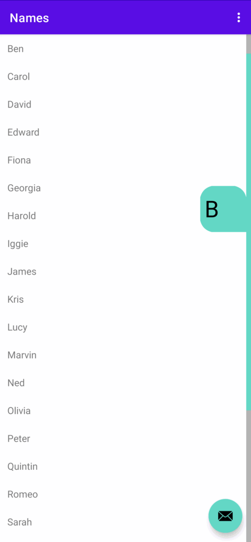
if (thumbSelected && valueLabelText != null) {
    // Position the canvas so that the value label is drawn next to the center of the scrollbar
    // thumb, except when doing so would cause the value label to fall outside the View.
    val scrollbarThumbCenterYCoordinate = (thumbRect.height().toFloat() / 2) + thumbRect.top
    val yStartToUse = if (valueLabelWidth > scrollbarThumbCenterYCoordinate) 0f
    else scrollbarThumbCenterYCoordinate - valueLabelWidth

    translate(0f, yStartToUse)
    drawPath(getValueLabelPath(), valueLabelPaint)

    // Draw the appropriate value text for the position in the RecyclerView
    valueLabelText?.let { text ->
        // Need to offset the text so it is visible while scrolling, but not so much that it
        // falls outside the value label
        val proposedXOffset = (valueLabelWidth / 2) - (thumbAndTrackWidth * 3)
        val xOffsetToUse = max(proposedXOffset, (valueLabelWidth / 4))
        val yOffsetToUse = (valueLabelWidth / 2) - (textBounds.top / 2)
        drawText(text, xOffsetToUse, yOffsetToUse, textPaint)
    }
}
The value label will only be visible if the user is actively selecting the scrollbar thumb and there is text to display. Next, the canvas drawing point is moved along the Y-axis so that the value label will be drawn next to the centre of the scrollbar thumb. Importantly, if the scrollbar thumb is small and positioned near the top of the View, then there is a chance that drawing the value label at the middle of the thumb could cause some of the value label to fall outside the View and become obscured. In this case, the starting Y coordinate is set to 0, so we can be sure the full value label will always be visible.
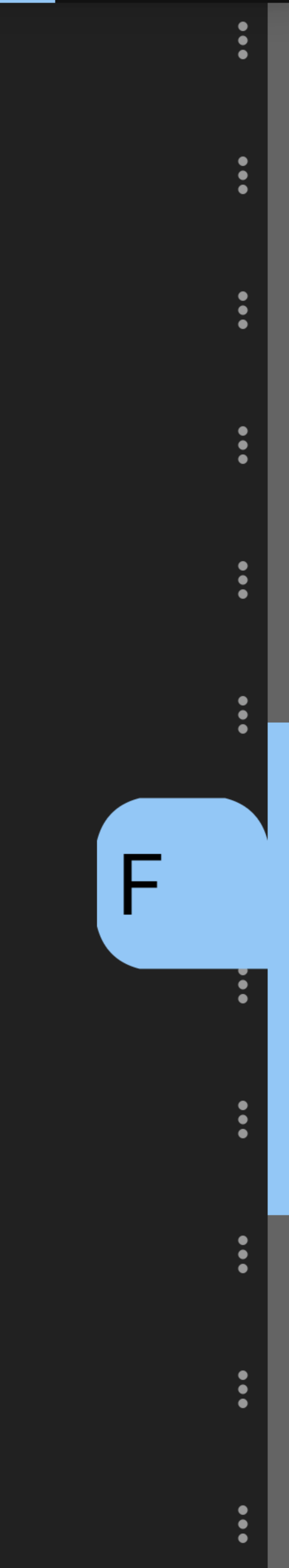
The value label will be a custom square shape with three rounded corners and one pointed corner, as shown below:
The instructions for drawing the custom value label shape are defined in a method called getValueLabelPath(), which we'll discuss in a moment. Finishing up the code, however, the value label text is drawn using a Canvas method called drawText. The X coordinate of the drawn text is calculated dynamically taking into account the size of the value label and scrollbar thumb. The reason for this is that we want the text to appear slightly to the left of the centre of the value label so that the text is not obscured by the user's thumb while scrolling. The text must never appear outside the value label bounds, so Kotlin's max function is used to ensure the X coordinate is always at least a quarter of the width of the value label.
For the final part of this section, we'll define a method called getValueLabelPath(), which generates the geometric shape required to draw the value label. The code for the getValueLabelPath() method is provided below:
private fun getValueLabelPath(): Path {
    val valueLabelCornerOffset = valueLabelWidth / 4
    val valueLabelCornerMidway = valueLabelCornerOffset / 5

    return Path().apply {
        moveTo(valueLabelWidth, valueLabelWidth)
        lineTo(valueLabelWidth, valueLabelCornerOffset)

        // Draw the top right corner
        val topRightX1 = valueLabelWidth - valueLabelCornerMidway
        val topRightX2 = valueLabelWidth - valueLabelCornerOffset
        quadTo(topRightX1, valueLabelCornerMidway, topRightX2, 0f)

        // Draw the top left corner
        lineTo(valueLabelCornerOffset, 0f)
        quadTo(valueLabelCornerMidway, valueLabelCornerMidway, 0f, valueLabelCornerOffset)

        // Draw the bottom left corner
        lineTo(0f, valueLabelWidth - valueLabelCornerOffset)
        val bottomLeftY1 = valueLabelWidth - valueLabelCornerMidway
        quadTo(valueLabelCornerMidway, bottomLeftY1, valueLabelCornerOffset, valueLabelWidth)
    }
}
The value label will be a square consisting of three rounded corners and a pointed bottom right corner. In the above code, this is achieved by drawing a line near each corner, and then using Path's quadTo method to create a rounded corner. Once each corner is drawn, the collective Path object is returned to the onDraw method so the value label can be rendered at the relevant position next to the scrollbar thumb.
Positioning the scrollbar thumb
The scrollbar track and thumb are rendered as Rect objects. While the track will be static and have the same height as the RecyclerView, the thumb will move based on the scroll position and have a height proportional to the size of the RecyclerView's contents. The initial measurements for the track and thumb should occur once the user interface has been initialised and the size of the View that the scrollbar will be rendered in has been measured. For this purpose, we can override a View method called onSizeChanged, as shown below:
// Variables declared at the top of the class
private var trackRect = Rect()
private var thumbRect = Rect()

override fun onSizeChanged(w: Int, h: Int, oldw: Int, oldh: Int) {
    super.onSizeChanged(w, h, oldw, oldh)
    if (w != 0 && h != 0) {
        trackRect.set(thumbAndTrackWidth, 0, 0, h)
        thumbRect.set(thumbAndTrackWidth, 0, 0, getThumbHeight())
    }
}
The onSizeChanged method is called whenever the size of the View's width and height measurements is changed. Initially, the width and height will be 0, but once the View has been rendered onto the user interface, the actual measurements will be available. The above implementation monitors for the first non-zero width and height measurements then updates the thumb and track Rect instances accordingly. To populate a Rect object, you must supply left, top, right and bottom values in that order. Both the track and thumb will be displayed on the right-hand side of the screen, so the above code assigns top and right values of 0. The left value is set to thumbAndTrackWidth, so the rectangles will have a width equal to the size specified in the thumbAndTrackWidth variable. Finally, the track will occupy the maximum available height of the View, so has a bottom value equal to the height of the View; however, the thumb height will be proportional to the size of the RecyclerView's content. For this reason, the height of the thumb is calculated separately by a method called getThumbHeight(). The implementation of the getThumbHeight() method is provided below:
private fun getThumbHeight(): Int {
    val viewHeightProportionOfContentHeight = measuredHeight.toFloat() /
        (recyclerViewContentHeight ?: measuredHeight)
    val thumbHeight = measuredHeight * viewHeightProportionOfContentHeight
    return when {
        thumbHeight > measuredHeight -> measuredHeight
        thumbHeight > thumbMinHeight -> thumbHeight.roundToInt()
        else -> thumbMinHeight
    }
}
The getThumbHeight method begins by dividing the height of the View by the height of all the RecyclerView's content. The output of this calculation is the proportion of the available height of the View that the thumb should occupy to allow full scrolling through the RecylcerView's content. The calculated proportional height of the thumb will be returned unless the height is smaller than the value stored in the thumbMinHeight variable. In which case, the value of thumbMinHeight will be returned instead. This safeguard prevents the thumb from becoming excessively small. The minimum thumb height can be set by the developer via the scrollbar's properties. Otherwise, the minimum height will be four times the width of the scrollbar track, as defined in the init block (see the RecyclerViewScrollbar.java class on GitHub).
Changes to the thumb position following scroll events will be handled by a method called updateScrollPosition(), which is defined using the following code:
// Variable defined at the top of the class
private var recyclerViewScrollPosition = 0
var lastActionNanoTime = System.nanoTime()

private fun updateScrollPosition() {
    recyclerViewContentHeight?.let { height ->
        visibility = VISIBLE

        // The scroll proportion will be between 0 (top) and 1 (bottom)
        val scrollProportion = recyclerViewScrollPosition.toFloat() / height
        // The scroll position will be the height of the View * the scroll proportion
        val scrollPosition = measuredHeight * scrollProportion

        // Update the y coordinate of the thumb to reflect the scroll position
        // The y coordinate should not cause the thumb to go off the screen,
        // and so maximum y coordinate values are provided as a fallback.
        val maximumTopValue = measuredHeight - getThumbHeight()
        val topValueToUse = min(scrollPosition.toInt(), maximumTopValue)

        val proposedBottomValue = scrollPosition + getThumbHeight()
        val bottomValueToUse = min(proposedBottomValue.toInt(), measuredHeight)

        thumbRect.set(thumbAndTrackWidth, topValueToUse, 0, bottomValueToUse)

        invalidate()
        lastActionNanoTime = System.nanoTime()
    }
}
The above code begins by ensuring that the scrollbar is visible (the scrollbar fades out after approximately a second of inactivity). Next, the proportion of the current scroll position (which will be sent over by the RecyclerView) relative to the RecyclerView's total content is calculated. We can multiply the progress proportion by the height of the View to get the corresponding position along the Y-axis that the scrollbar thumb should move to. The scroll position is then incorporated into the top and bottom values of the thumbRect Rect instance, which effectively moves the thumb along the Y-axis to reflect the scroll position. Importantly, the above code incorporates minimum and maximum permissible values to ensure the thumb never disappears off the screen. Once the thumbRect coordinates have been set, a View method called invalidate is used to redraw the scrollbar to the user interface, thereby updating the thumb position.
Once the scrollbar has been redrawn, a variable called lastActionNanoTime is updated with the system timestamp in nanoseconds. The reason for this is that the scrollbar will fade out after a period of inactivity, so it is important to record the last time that an action occurred.
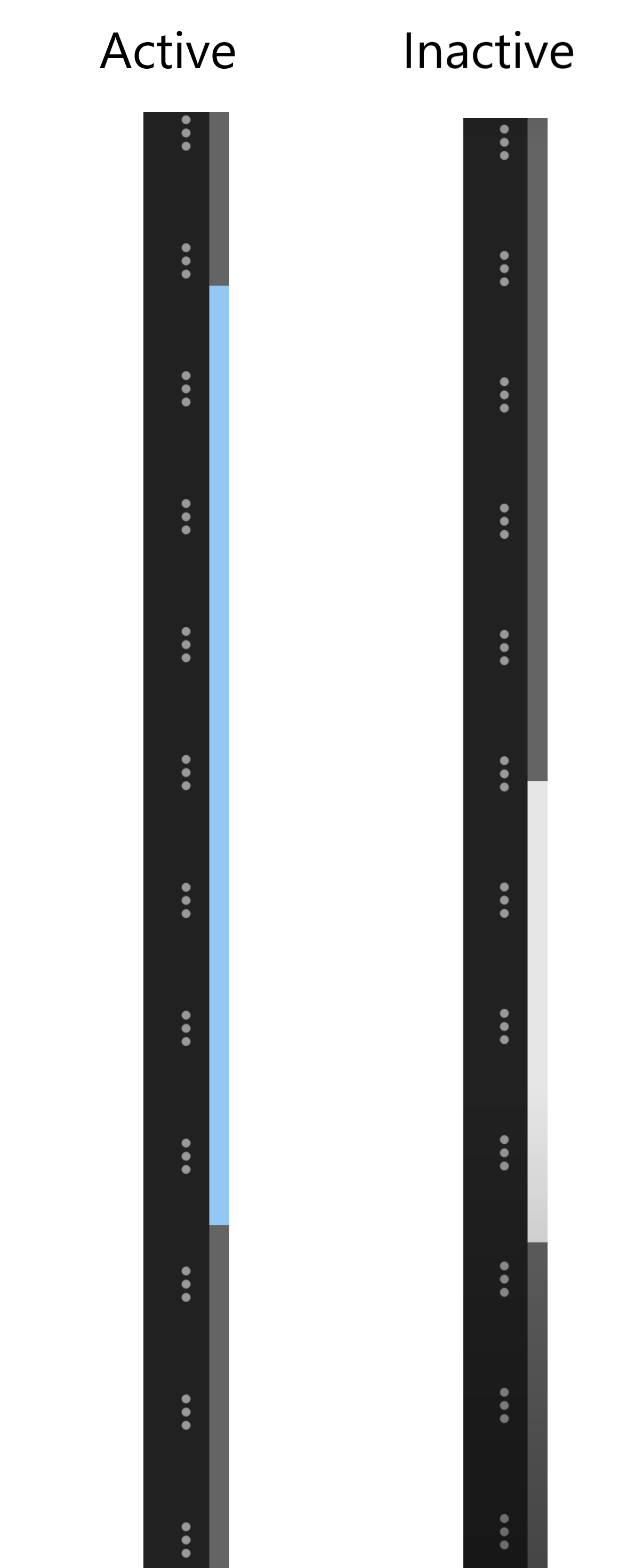
Fading out the scrollbar following inactivity
The scrollbar will disappear using a fade animation after a short period of inactivity. Inactivity will be monitored using a runnable, which will continue to assess the amount of time that has elapsed since the last scroll or user action occurred. To define the runnable, add the following code to the top of the RecyclerViewScrollbar class:
private val animationDuration = context.resources
    .getInteger(android.R.integer.config_mediumAnimTime).toLong()

private var fadeOutScrollbarRunnable = object : Runnable {
    override fun run() {
        val timeElapsed = System.nanoTime() - lastActionNanoTime
        try {
            // If the scrollbar thumb is not selected and one second has passed then hide the thumb
            if (!thumbSelected && timeElapsed >= 1000000000) {
                animate()
                    .alpha(0f)
                    .setDuration(animationDuration)
                    .setListener(object : AnimatorListenerAdapter() {
                        override fun onAnimationEnd(animation: Animator) {
                            visibility = INVISIBLE
                        }
                    })
            }
        } finally {
            handler.postDelayed(this, 1000L)
        }
    }
}
The runnable evaluates the time that has elapsed since the last scrollbar action by subtracting the value of the lastActionNanoTime variable from the system timestamp. As you may recall from the previous section, the lastActionNanoTime variable is updated whenever the scroll position changes. Next, an if expression checks that the thumb is not currently selected (more on handling user interactions in the next section) and that more than one second (1000000000 nanoseconds equals one second) has passed since the last scroll event. If both of these conditions are true, then a method called animate is used to change the alpha of the scrollbar to 0, which is fully transparent, and then set the visibility of the View to INVISIBLE. The View will only become visible again if a new scroll event or user action occurs. The duration of the animation will be the typical medium duration length for Android animations, as dictated by the user's device.
Once all the above code has been executed, a finally block uses the View's handler instance to instruct the runnable to repeat in one-second (1000 millisecond) intervals. The purpose of this delay between repetitions is to prevent the runnable from repeating too frequently and causing an unnecessary drain on the device's resources.
For the final part of this section, we need to ensure the scrollbar is visible when the user interface is loaded, initiate the runnable, and stop the runnable again when the layout managing the scrollbar is destroyed. To achieve this, add the following code to the RecyclerViewScrollbar class:
override fun onAttachedToWindow() {
    super.onAttachedToWindow()
    visibility = INVISIBLE
    fadeOutScrollbarRunnable.run()
}

override fun onDetachedFromWindow() {
    super.onDetachedFromWindow()
    handler.removeCallbacks(fadeOutScrollbarRunnable)
}

override fun setVisibility(visibility: Int) {
    super.setVisibility(visibility)
    if (visibility == VISIBLE) alpha = 1f
}
The onAttachedToWindow and onDetachedFromWindow methods refer to the stages of the View lifecycle when a View is attached and removed from the user interface layout, respectively. The attachment phase is the best time to ensure the View is visible and start the runnable. Meanwhile, the detachment stage is the recommended time to stop further calls from the handler to the runnable, thereby preventing memory leaks.
The final method, setVisibility, defines how the View will handle changes in visibility. In this case, we simply instruct the View to also set the alpha back to 1 (fully opaque) when the visibility is set to VISIBLE. Doing so is necessary to reverse the change in View alpha following the fade-out animation. Otherwise, the scrollbar may still not be visible to the user, despite the change in the View's visibility status.
Handling user interactions and touch events
The scrollbar will allow the user to alter the scroll position by dragging the thumb. To handle user interactions, we need to override a method called onTouchEvent. A suitable implementation for the RecyclerViewScrollbar class is provided below:
@SuppressLint("ClickableViewAccessibility")
override fun onTouchEvent(event: MotionEvent?): Boolean {
    val y = event?.y ?: 0f

    when (event?.action) {
        MotionEvent.ACTION_DOWN, MotionEvent.ACTION_MOVE -> {
            visibility = VISIBLE
            recyclerViewContentHeight?.let { height ->
                val scrollProportion = y / measuredHeight
                val newScrollPosition = scrollProportion * height
                scrollToRecyclerViewPosition(newScrollPosition.toInt())
            }
            thumbSelected = true
            thumbPaint.color = thumbOnColour
            if (event.action == MotionEvent.ACTION_DOWN) invalidate()
            return true
        }
        MotionEvent.ACTION_CANCEL, MotionEvent.ACTION_UP -> {
            thumbSelected = false
            thumbPaint.color = thumbOffColour
            invalidate()
            return true
        }
    }

    return super.onTouchEvent(event)
}
In the above code, the onTouchEvent method finds the y coordinate of where the touch event is occurring. Next, the method determines the type of touch gesture. If the user is pressing down or dragging the thumb then the scrollbar's visibility is set to visible. Next, the y coordinate of the touch event is divided by the total height of the View to calculate the corresponding scroll progress. A method called scrollToRecyclerViewPosition, will then notify the RecyclerView of the new scroll position. Finally, the Paint used to colour the scrollbar thumb is set to its active colour, and the View is invalidated and redrawn if necessary so the change is shown on the user interface.
If the scrollbar thumb is released, then ACTION_CANCEL or ACTION_UP motion events will occur. In which case, the scrollbar thumb is reverted to its original inactive colour and the View is invalidated and redrawn. Note that both blocks of code end by returning a value of 'true'. The reason for this is that returning true from the onTouchEvent signals that the touch event has been fully handled and no further action is required. If we return false or do not explicitly return true, then the touch event may propagate to other components of the user interface and other unwanted responses to the touch event may occur.
The position that the user has scrolled to is broadcast to the RecyclerView using a method called scrollToRecyclerViewPosition, which you can define using the following code:
// Variable defined at the top of the class
var recyclerView: RecyclerView? = null

private fun scrollToRecyclerViewPosition(position: Int) {
    recyclerView?.apply {
        val maximumScrollPosition = this.computeVerticalScrollRange()
        val scrollToProportion = if (position > maximumScrollPosition) 1f
        else position.toFloat() / maximumScrollPosition
        val scrollToPosition = scrollToProportion * (adapter?.itemCount ?: return)

        this.scrollToPosition(scrollToPosition.roundToInt())
    }
}
First, the scrollToRecyclerViewPosition method calculates the scroll proportion by dividing the scroll position by the size of the RecyclerView's contents. Next, the scroll proportion is multiplied by the number of items loaded into the RecyclerView to determine the index of the item that should be scrolled to. Finally, the RecyclerView's scrollToPosition method is used to scroll to the target item, thereby completing the scroll action.
Monitoring the RecyclerView's content and scroll position
The scrollbar will continuously monitor the RecyclerView's content size and scroll position. To do this, we will create an OnScrollListener class, which developers can assign to the RecyclerView widget. The OnScrollListener class will monitor the RecyclerView and broadcast necessary information to the scrollbar, so that scroll events can be handled. To define the OnScrollListener class, add the following code:
open class OnScrollListener(private val scrollbar: RecyclerViewScrollbar): RecyclerView.OnScrollListener() {
    override fun onScrolled(recyclerView: RecyclerView, dx: Int, dy: Int) {
        super.onScrolled(recyclerView, dx, dy)

        val contentSize = recyclerView.computeVerticalScrollRange()
        scrollbar.notifyRecyclerViewContentHeightChanged(contentSize)

        val scrollPosition = recyclerView.computeVerticalScrollOffset()
        scrollbar.notifyRecyclerViewScrollPositionChanged(scrollPosition)

        // TODO: The value label text will be handled here
    }
}
The OnScrollListener class defined above requires an instance of the RecyclerViewScrollbar class to be supplied as a parameter in the primary constructor. The OnScrollListener class then broadcasts the size of the RecyclerView's content and scroll position to the RecyclerViewScrollbar instance whenever a scroll event occurs. Information about text to display in the value label will also be broadcast, but we will implement this in the next section. You may notice the OnScrollListener class is labelled with the 'open' modifier. The open modifier allows developers to extend and override the class if they wish. For example, developers may want to perform additional actions in response to scroll events. For more information about how the OnScrollListener class can be implemented and extended, then refer to our tutorial on how to use the RecyclerView scrollbar.
The RecyclerViewScrollbar class will process incoming information about the size and scroll position of the RecyclerView using methods called notifyRecyclerViewContentHeightChanged and notifyRecyclerViewScrollPositionChanged, respectively. To define these methods, add the following code to the RecyclerViewScrollbar class:
fun notifyRecyclerViewContentHeightChanged(height: Int) {
    if (height != recyclerViewContentHeight && height >= 0) {
        recyclerViewContentHeight = height
    }
}

fun notifyRecyclerViewScrollPositionChanged(position: Int) {
    recyclerViewScrollPosition = position
    updateScrollPosition()
}
The notifyRecyclerViewContentHeightChanged updates the recyclerViewContentHeight variable whenever the new content size value is greater than zero and different to the content size value already held. Meanwhile, the notifyRecyclerViewScrollPositionChanged method updates the recyclerViewScrollPosition variable with the newly supplied scroll position, and then calls a method called updateScrollPosition (which we defined previously). The scrollbar is then redrawn to reflect the new scroll position (and content height if applicable).
Rendering the value label's text
The RecyclerViewScrollbar class will contain an interface called ValueLabelListener that developers can attach to RecyclerView adapters. The ValueLabelListener interface features a method called getValueLabelText, which allows the developer to specify what String of text should be displayed at a given position in the RecyclerView. To define the ValueLabelListener interface, add the following code to the RecyclerViewScrollbar class:
interface ValueLabelListener {

    fun getValueLabelText(position: Int): String
}
An implementation of the ValueLabelListener in a RecyclerView adapter may look as follows (for a more comprehensive example, see our other tutorial on how to use the RecyclerView scrollbar):
class NamesAdapter : Adapter(), RecyclerViewScrollbar.ValueLabelListener {
    var names = listOf<String>()

    override fun getValueLabelText(position: Int): String {
        return names[position][0].uppercase()
    }
}
The value label text will be rendered using code we already wrote for onDraw method; however, we need a little bit of additional code to handle the content and size of the value label text. For this purpose, add the following code to the RecyclerViewScrollbar class:
// Variables defined at the top of the class
private var valueLabelText: String? = null
private val textBounds = Rect()

fun setValueLabelText(text: String?) {
    valueLabelText = text
    // Transmit the Rect bounds of the value label text to the textBounds variable.
    textPaint.getTextBounds(text, 0, (text?.length ?: 0), textBounds)
}
The above code assigns the String that will be displayed in the value label to a variable called valueLabelText. Next, the size of the text is calculated using a Paint method called getTextBounds. The getTextBounds method requires you to supply as parameters the text to be analysed, the indices of the first and last characters to include in the measurements (we use the first and last characters, respectively, to capture the whole String), and a Rect instance that measurements should be stored in. The Rect instance is stored in a variable called textBounds, which the onDraw method we defined earlier uses to position the value label text.
Finally, to ensure the value label text is updated dynamically during scroll events, replace the TODO comment we added to the onScrolled method of the OnScrollListener class in the previous section with the following code:
if (recyclerView.adapter is ValueLabelListener) {
    val scrollProportion = scrollPosition.toFloat() / contentSize
    val itemCount = (recyclerView.adapter as RecyclerView.Adapter).itemCount
    val activePosition = (scrollProportion * itemCount).roundToInt()

    val valueLabelText = (recyclerView.adapter as ValueLabelListener)
        .getValueLabelText(activePosition)
    scrollbar.setValueLabelText(valueLabelText)
}
The above code will only run if the RecyclerView that the scrollbar is applied to features an adapter that extends the ValueLabelListener interface. In which case, the RecyclerView item associated with the current scroll position is calculated. The item index is then passed to the adapter's getValueLabelText method, which will return the text to display in the value label. The returned text is processed by the setValueLabelText method and rendered in the value label when the scrollbar is drawn.