How to make your website's navigation bar responsive (mobile-friendly)
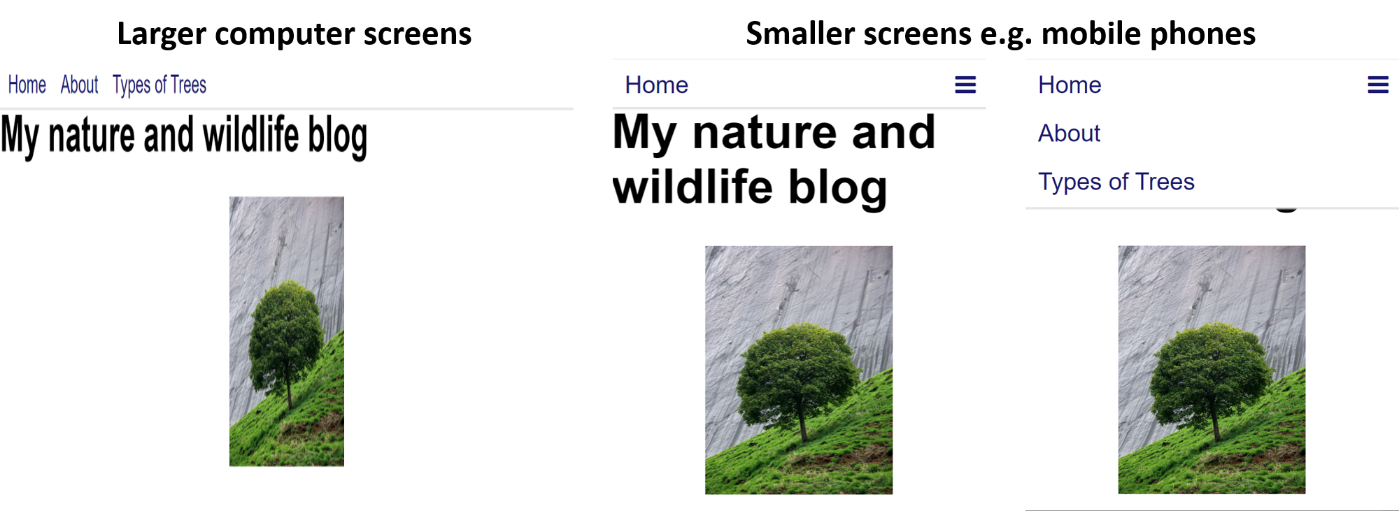
When you build a website, it is important to check it looks good and works correctly on both computers and mobile devices. One key consideration is the different screen sizes of these devices; content that looks good on a computer may not display correctly on smaller screen sizes and mobile devices. A website that adapts to different screen sizes is said to be "responsive". In this tutorial, we will explore how to make your website's navigation bar responsive using HTML, CSS and JavaScript.
HTML code
In our tutorial on how to build a navigation bar, we enclosed the navigation bar's contents in a div element that was assigned the class 'navbar'. To complete this tutorial, you will also need to assign the div element an id of 'myTopnav' as shown below:
<div class="navbar" id="myTopnav">An id is similar to a class and allows an element to be styled using CSS or made interactive using JavaScript; however, unlike classes, id's are only meant to be used by one element. The id we have applied here will be used later when we make the navigation bar collapsable/expandable on small screens.
To make the navigation bar functional on small screens, we must add an icon that allows visitors to collapse and expand the contents of the navigation bar. The bars icon we will use is shown below.

To use the bars icon on your website, you will need to import the font awesome stylesheet: an external stylesheet which gives your website access to over a thousand icons. To incorporate the stylesheet, add the following code to the head element of your HTML file:
<link rel="stylesheet" href="https://cdnjs.cloudflare.com/ajax/libs/font-awesome/4.7.0/css/font-awesome.min.css">Next, to add the bars icon to the web page, insert the following code after the links in your navigation bar:
<a href="javascript:void(0);" class="icon" onclick="expansion()">
    <i class="fa fa-bars"></i>
</a>
The above code defines an i (icon) element that will display the bars icon from the font awesome stylesheet. The icon element is enclosed in an anchor element that runs a JavaScript function called expansion() when clicked. We will define the expansion() function shortly. It will expand and retract the navigation bar.
Altogether, the complete entry for the navigation bar in the HTML file should look like this:
<div class="navbar" id="myTopnav">
    <a href="http://treesandtrees.com">Home</a>
    <a href="http://treesandtrees.com/About/">About</a>
    <a href="http://treesandtrees.com/TreeTypes/">Types of Trees</a>
    <a href="javascript:void(0);" class="icon" onclick="expansion()">
        <i class="fa fa-bars"></i>
    </a>
</div>
CSS code
We'll now turn our attention to how the navigation bar should be styled. Open the 'main.css' stylesheet and add the following entry:
.navbar .icon {
    display: none;
}
The above CSS code applies to all elements with the icon class that are children of an element with the navbar class. An element is referred to as a child of another element if it is enclosed inside it. For example, in our HTML code, you will notice the anchor tag with the icon class is enclosed in the div element with the navbar class. The anchor element, therefore, is a child of the div element. Formatting the CSS selector in this way is useful if you only want to style elements that fulfil certain criteria (e.g. being children of another element). In the above CSS code, all elements with the icon class that are children of elements with the navbar class will have a display property set to none, which means they will be hidden by default. The bars icon will only be visible on small screens. To reveal the bars icon on small screens, add the following CSS code:
@media screen and (max-width: 650px) {
    .navbar a:not(:first-child) {display: none;}
    .navbar a.icon {
        display: block;
        float: right;
    }
}
In the above code, the @media screen and (max-width: 650px) declaration is a media query that instructs the web browser to only apply the forthcoming CSS code if the screen size is less than 650px wide (e.g. mobile phones). Adding the :not(:first-child) selector after .navbar a is optional but will ensure the first link in the navigation bar (e.g. 'Home') is exempt from the display: none; property. This means the Home link will continue to be displayed even when all other links are hidden. Instructing .navbar a.icon to display as a block and float to the right reveals the bars icon on small screens and positions it on the right-hand side of the navigation bar.
If the user clicks the bars icon, then a JavaScript function (that we will define shortly) will append a class called expanded to the div element that encloses the navigation bar. The expanded class will reveal the previously hidden navigation bar items. To facilitate this, add the following CSS code:
@media screen and (max-width: 650px) {
    .navbar.expanded a.icon {
        position: absolute;
        right: 0;
        top: 0;
    }
    .navbar.expanded a {
        float: none;
        display: block;
        text-align: left;
    }
}
In the above code, the .navbar.expanded a.icon entry fixes the bars icon in the top right-hand corner of the navigation bar. Meanwhile, .navbar.expanded a determines how the links will appear after the bars icon is clicked and the navigation bar expands. The 'block' display property unhides the links, while the 'none' float and 'left' text-align properties ensure the links organise themselves down the left-hand side of the expanded navigation bar.
If you followed our tutorial on how to build a navigation bar then you may have declared a 'height' CSS attribute for the .navbar class. While a fixed height value can prevent the navigation bar from obscuring other parts of the webpage, it also stops the navigation bar from expanding when the bars icon is clicked. To override this, you should make an entry for .navbar.expanded and set its height attribute to 'auto'. Doing this ensures the navigation bar can expand as far as it needs to when the bars icon is clicked.
.navbar.expanded {
    height: auto;
}
JavaScript code
To make the bars icon operation, we must write a JavaScript function. JavaScript helps make your web pages interactive. We could copy and paste the JavaScript code into the head element of each web page that uses the navigation bar; however, this is suboptimal. If we are going to use the same JavaScript on multiple webpages then it makes more sense to link all web pages with the navigation bar to a single JavaScript file (similar to how we link multiple webpages to the same CSS stylesheet). For this reason, create a new JavaScript file in your code editor and save it in the same folder as your homepage (index.html). Use the filename 'navbar' and JavaScript file (.js) extension, so the full file should be called navbar.js. Once that is done, add the following code to the navbar.js file:
function expansion() {
  var x = document.getElementById("myTopnav");
  if (x.className === "navbar") {
    x.className += " expanded";
  } else {
    x.className = "navbar";
  }
}
The above code will add the 'expanded' class to the 'navbar' class when the bars icon is clicked. It allows the navigation bar to expand and reveal its navigation links. If the bars icon is clicked again then the 'expanded' class is removed and the links are hidden once more.
Next, return to your HTML web page and add the following statement to the head element to import the navbar.js file:
<script src="navbar.js"></script>If the HTML web page is in a subfolder relative to the navbar.js file, then you will need to add '../' before 'navbar.js'. '../' tells the browser the 'navbar.js' file is located in a parent folder.
Altogether, the overall HTML file should look like this:
<!DOCTYPE html>
<html lang="en-GB">
<head>
    <title>Home</title>
    <meta charset="utf-8">
    <meta name="viewport" content="width=device-width, initial-scale=1.0">
    <link rel="stylesheet" type="text/css" href="main.css">
    <link rel="stylesheet" href="https://cdnjs.cloudflare.com/ajax/libs/font-awesome/4.7.0/css/font-awesome.min.css">
    <script src="navbar.js"></script>
</head>
<body>
    <div class="navbar" id="myTopnav">
        <a href="http://treesandtrees.com">Home</a>
        <a href="http://treesandtrees.com/About/">About</a>
        <a href="http://treesandtrees.com/TreeTypes/">Types of Trees</a>
        <a href="javascript:void(0);" class="icon" onclick="expansion()">
            <i class="fa fa-bars"></i>
        </a>
    </div>
</body>
</html>