How to create a Camera application using Kotlin
For this project, we will create an app that allows the user to capture photos using the camera on their device. The app will also display a gallery of all the images on their device and allow the user to apply filters or delete images if they wish. In creating this app, you will learn how to use the CameraX library to capture photos, apply an image rendering module called Glide to display and edit images and interact with files using the scoped storage framework. The scoped storage framework is a recent Android development designed to protect the user’s privacy by limiting an app’s access to files it did not create.
The example code for the Camera application can be found here. The project was built using Android Studio Giraffe and targets Android 13 (API 33/SDK 33).
Getting started
Let’s begin. Open Android Studio and create a new project using the Bottom Navigation Views Activity project template.
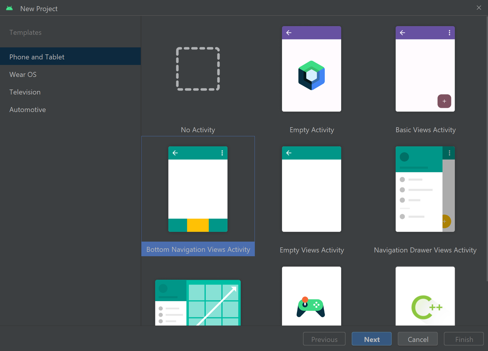
The Bottom Navigation Views Activity project template provides your app with a navigation bar at the bottom of the screen, as well as several readymade fragments. Each fragment represents a different destination in the app, which the user will be able to navigate using the navigation bar. In this app, there will be separate fragments for the camera and image gallery.
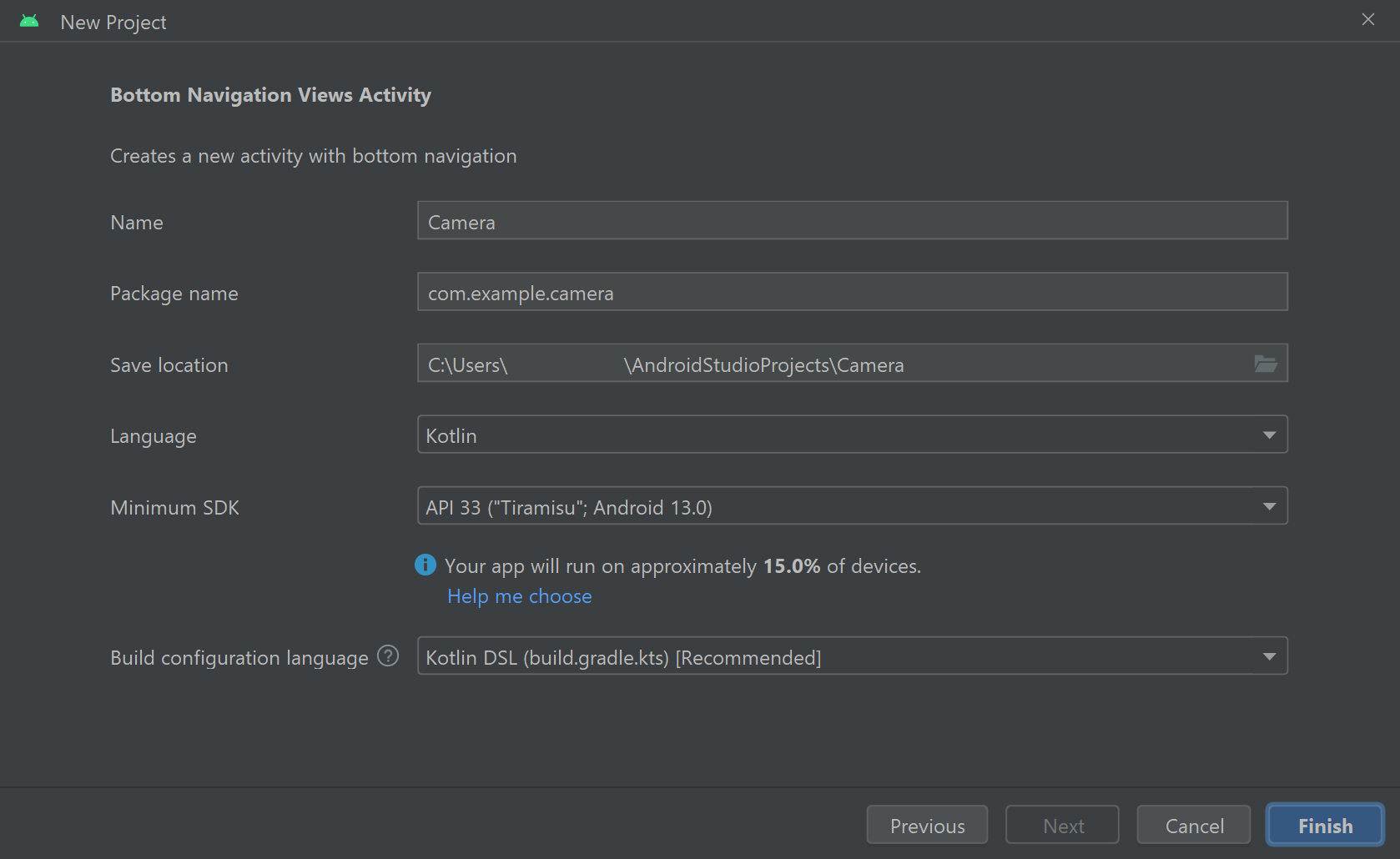
In the Create New Project window, specify a name for the project (e.g. Camera), set the language to Kotlin and use API level 33.
As recommended when creating the Notes app, you may like to enable Auto Imports to direct Android Studio to automatically add any necessary import statements to your Kotlin files as you code. These import statements are essential for incorporating the external classes and tools required for the app to run. To enable Auto Imports, open Android Studio’s Settings window by clicking File > Settings. In the Settings window, navigate through Editor > General > Auto Import then select ‘Add unambiguous imports on the fly’ and ‘Optimise imports on the fly’ for both Java and Kotlin then press Apply and OK.
Android Studio should now add most of the necessary import statements to your Kotlin class files automatically. Sometimes there are multiple classes with the same name and the Auto Import feature will not work. In these instances, the requisite import statement(s) will be specified explicitly in the example code. You can also refer to the finished project code to find the complete files including all import statements.
Configuring the Gradle Scripts
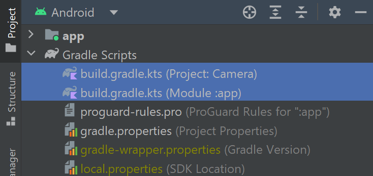
For the app to perform all the operations we want it to, we must manually import several external packages using a toolkit called Gradle. To do this, navigate through Project > Gradle Scripts and open both the Project and Module build.gradle.kts files:
In the Project-level build.gradle.kts file, add the following entry to the plugins element:
id("androidx.navigation.safeargs.kotlin") version "2.5.3" apply falseThe above classpath is required to use a feature called safe args, which is a method for transferring data between destinations in the app.
Next, switch to the Module-level build.gradle.kts file and add the following lines to the plugins element at the top of the file:
id("kotlin-parcelize")
id("androidx.navigation.safeargs.kotlin")
Finally, refer to the dependencies element and add the following code to the list of implementation statements:
val lifecycleVersion = "2.6.2"
implementation("androidx.lifecycle:lifecycle-extensions:2.2.0")
implementation("androidx.lifecycle:lifecycle-common-java8:$lifecycleVersion")
implementation("androidx.lifecycle:lifecycle-viewmodel-ktx:$lifecycleVersion")

implementation("com.github.bumptech.glide:glide:4.11.0")
implementation("jp.wasabeef:glide-transformations:4.3.0")
implementation("jp.co.cyberagent.android:gpuimage:2.1.0")

val cameraxVersion = "1.4.0-alpha01"
implementation("androidx.camera:camera-camera2:$cameraxVersion")
implementation("androidx.camera:camera-lifecycle:$cameraxVersion")
implementation("androidx.camera:camera-view:$cameraxVersion")
The above implementation statements enable your app to access several lifecycle tools, an image rendering tool called Glide, a Glide add-on package called Glide Transformations which we will use to apply filters to images, and Android’s CameraX library.
We’re now finished with the Gradle Scripts files. Don’t forget to re-sync your project when prompted!

Over time, you may notice some parts of your Grade Scripts files are highlighted in yellow as follows:
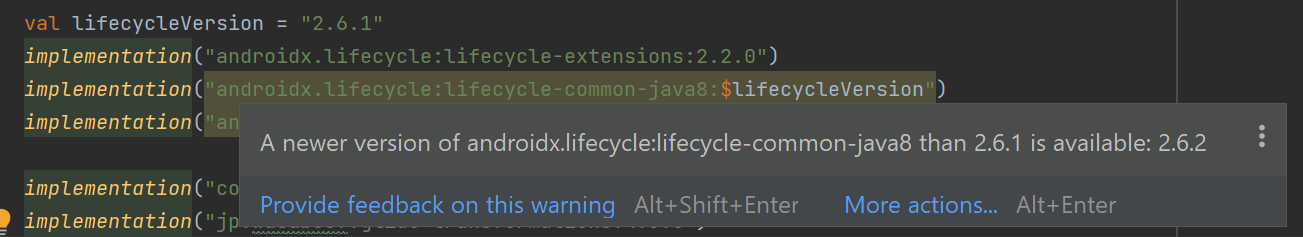
This often means the version number is outdated. If you hover over the highlighted text with your mouse then Android Studio will likely allow you to use the latest version number. It is usually fine to follow Android Studio’s recommendation and re-sync your Gradle files; however, you may want to double-check any affected features continue to work as expected.
Defining the String resources used in the app
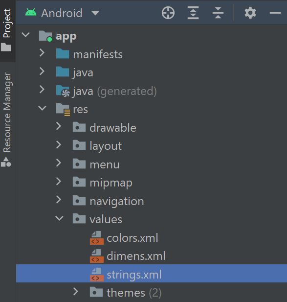
Each item of text that the app will display to the user should be stored as a string resource. A single string can be used in multiple locations across the app, which makes it easier to edit the text because you only have to change one string resource, rather than each instance of the text throughout the app. Android Studio will often generate a resource file called strings.xml to store your strings when you create a new project. To locate the strings.xml file, navigate through Project > app > res > values.
Update the contents of the strings.xml file so it contains the following strings:
<resources>
<string name="app_name">Camera</string>
<string name="capture_photo">Capture a photo</string>
<string name="delete_image">Delete image</string>
<string name="image">Image</string>
<string name="ok">OK</string>
<string name="save">Save</string>
<string name="camera">Camera</string>
<string name="gallery">Gallery</string>
<string name="error_connecting_camera">There was an error connecting to the camera.</string>
<string name="error_saving_photo">There was an error saving the photo.</string>
<string name="photo_saved">Photo saved!</string>
<string name="photo_deleted">Photo deleted.</string>
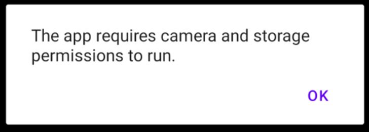
<string name="permission_required">The app requires camera and storage permissions to run.</string>
</resources>Each string resource contains a name attribute. The name attribute is what you will use to reference the string elsewhere in the app. The text that will be displayed to the user is input between the opening <string name=””> and closing </string> tags.
Requesting permission to access the camera and storage
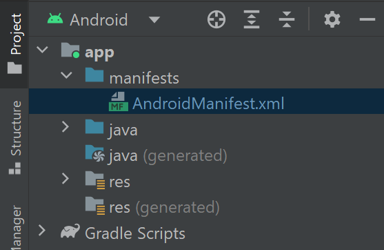
The application will require permission from the user to access the device’s cameras and files. All required permissions must be declared in the application’s manifest file, which the Google Play store will use to inform potential users what permissions they will need to provide if they install your app. To configure the manifest file, navigate through Project > app > manifests and open the file called AndroidManifest.xml.
Next, add the following code above the application element:
<uses-feature
    android:name="android.hardware.camera"
    android:required="true" />

<uses-permission android:name="android.permission.CAMERA" />
<uses-permission android:name="android.permission.READ_MEDIA_IMAGES" />
The above elements state that the application will require access to the device's camera and what user permissions are required for the app to run. In this case, the app will require access to the device’s cameras and images stored in the device.
Let’s now implement the code which prompts the user to grant the permissions. To handle all permission-related processes, we will create an object called CameraPermissionHelper in the MainActivity class. The CameraPermissionHelper object will contain methods for initiating and handling permissions-related requests. Locate and open the MainActivity.kt file by navigating through Project > app > java > name of the project. Next, add the following code below the onCreate method to define the CameraPermissionHelper object:
object CameraPermissionHelper {
    private const val CAMERA_PERMISSION = Manifest.permission.CAMERA
    private const val READ_MEDIA_PERMISSION = Manifest.permission.READ_MEDIA_IMAGES

    fun hasCameraPermission(activity: Activity): Boolean {
        return ContextCompat.checkSelfPermission(activity, CAMERA_PERMISSION) == PackageManager.PERMISSION_GRANTED
    }

    fun hasStoragePermission(activity: Activity): Boolean {
        return ContextCompat.checkSelfPermission(activity, READ_MEDIA_PERMISSION) == PackageManager.PERMISSION_GRANTED
    }

    fun requestPermissions(activity: Activity) {
        if (ActivityCompat.shouldShowRequestPermissionRationale(activity, CAMERA_PERMISSION)) {
            AlertDialog.Builder(activity).apply {
                setMessage(activity.getString(R.string.permission_required))
                setPositiveButton(activity.getString(R.string.ok)) { _, _ ->
                    ActivityCompat.requestPermissions(activity,
                        arrayOf(CAMERA_PERMISSION, READ_MEDIA_PERMISSION), 1)
                }
                show()
            }
        } else {
            ActivityCompat.requestPermissions(activity,
                arrayOf(CAMERA_PERMISSION, READ_MEDIA_PERMISSION), 1)
        }
    }
}
Note you may need to add the following import statements to the top of the file:
import android.app.AlertDialog
import android.Manifest
The first two methods defined in the CameraPermissionHelper object are called hasCameraPermission and hasReadPermission. The methods check whether the user has granted the application permission to access the device’s camera and storage, respectively. Each method returns a boolean (true or false) value indicating whether or not the relevant permission has been granted.
The next method is called requestPermissions and it is used to request the camera and storage permissions. The user can either grant or refuse permission. If they refuse, the user might not understand why the permissions have been requested. In this case, we can use a method called shouldShowRequestPermissionRationale to check whether the user has refused a given permission. If the permission has been refused, then the shouldShowRequestPermissionRationale method returns a value of true. In this case, the above code builds an alert dialog that will display the message contained in the permission_required string resource. The alert dialog will also feature an OK button that will request the permissions again when clicked.
Moving on, we’ll now write the code which processes the user’s response to the permissions request. Add the following code below the onCreate method:
override fun onRequestPermissionsResult(requestCode: Int, permissions: Array, grantResults: IntArray) {
   super.onRequestPermissionsResult(requestCode, permissions, grantResults)
   if (!CameraPermissionHelper.hasCameraPermission(this) || !CameraPermissionHelper.hasStoragePermission(this)) {
       CameraPermissionHelper.requestPermissions(this)
   } else recreate()
}
The onRequestPermissionsResult function handles the user’s response to the permissions request. In the above code, the CameraPermissionHelper object’s hasCameraPermission or hasStoragePermission methods check whether all required permissions have been granted. If either method returns a value of false, then this means the user has refused to grant permission. Consequently, the app will run the CameraPermissionHelper object’s requestPermissions method again and show the rationale for the permission request. If the hasCameraPermission and hasStoragePermission methods both return values of true, then the recreate method will reload the activity because the necessary user permissions have been granted.
Setting up the Camera fragment and layout
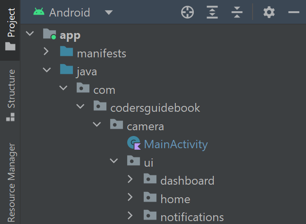
In this section, we will create a fragment that opens the rear-facing camera on the user’s device and allows them to take photos. Android Studio automatically generated three fragments when the project was created. You can locate them by navigating through Project > app > java > name of the project > ui.
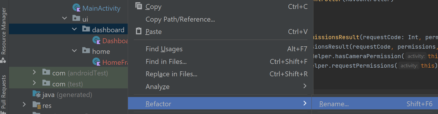
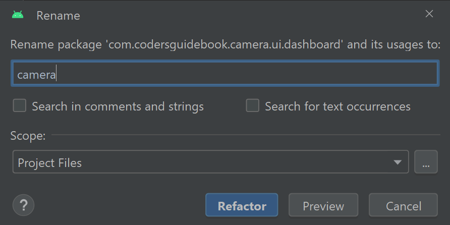
For this app, we will only require two fragments, so right-click one of the fragment folders (e.g. notifications) and press Delete. We will also not require the view models for the two remaining fragments, so right-click the DashboardViewModel.kt and HomeViewModel.kt files and press Delete. Finally, we must rename the remaining fragment files. Android Studio provides a refactor option that allows you to rename an item (e.g. a file, variable or class) and automatically update all other areas in the app which refer to the item. In this way, you can change the name of application components without creating errors in your code. To refactor the Dashboard package, right-click the dashboard folder then press Refactor > Rename.
Set the name to camera then press Refactor.
Next, right-click the DashboardFragment file and again select Refactor > Rename. Set the new name to CameraFragment then press Refactor.
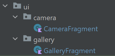
The camera fragment and directory have now been successfully refactored. At this point, it may be a good opportunity to also prepare the image gallery package and fragment. To do this, refactor the home directory to gallery and refactor the HomeFragment file to GalleryFragment.
The camera fragment will require a layout file to display a live feed of the camera’s input and allow the user to capture photos. To implement this, locate the layout folder by navigating through Project > app > res. The readymade fragment_dashboard.xml, fragment_home.xml and fragment_dashboard.xml files can be deleted because we will not use them. Next, create a new layout file by right-clicking the layout folder and selecting New > Layout Resource File.
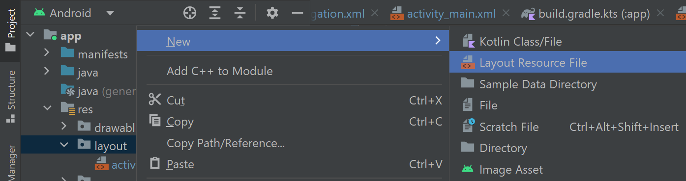
Name the file fragment_camera then press OK. Once the fragment_camera.xml file opens in the editor, switch the layout to Code view and edit its contents as follows:
<?xml version="1.0" encoding="utf-8"?>
<androidx.constraintlayout.widget.ConstraintLayout xmlns:android="http://schemas.android.com/apk/res/android"
xmlns:app="http://schemas.android.com/apk/res-auto"
android:layout_width="match_parent"
android:layout_height="match_parent">
<androidx.camera.view.PreviewView
android:id="@+id/camera_feed"
android:layout_width="match_parent"
android:layout_height="match_parent" />
<com.google.android.material.floatingactionbutton.FloatingActionButton
android:id="@+id/fab_take_photo"
android:layout_width="56dp"
android:layout_height="56dp"
android:layout_marginBottom="24dp"
android:src="@drawable/ic_camera"
android:contentDescription="@string/capture_photo"
app:layout_constraintStart_toStartOf="parent"
app:layout_constraintEnd_toEndOf="parent"
app:layout_constraintBottom_toBottomOf="parent" />
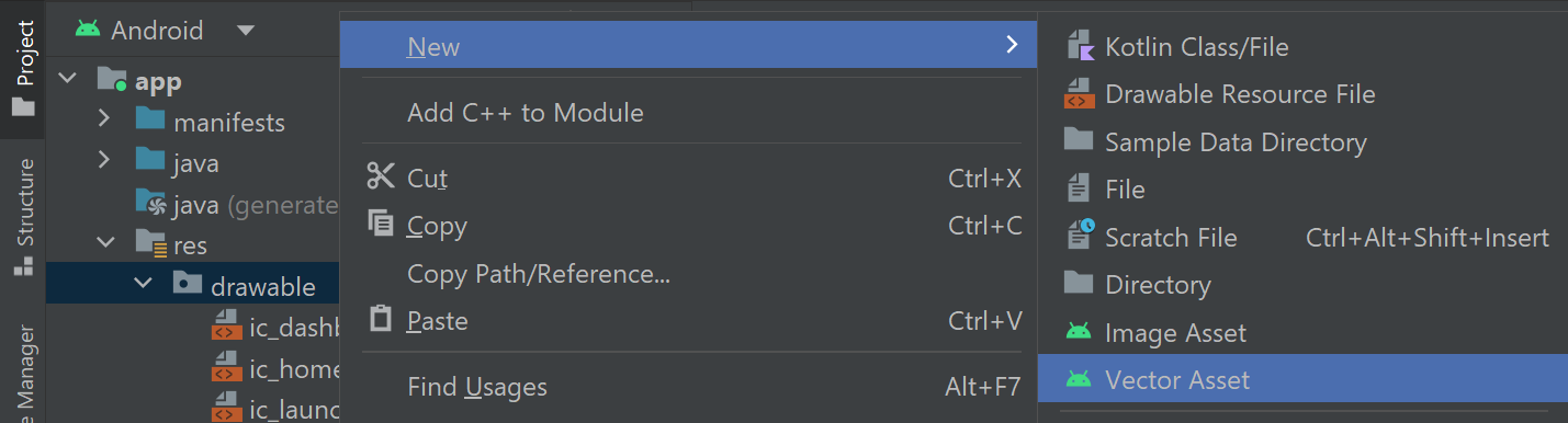
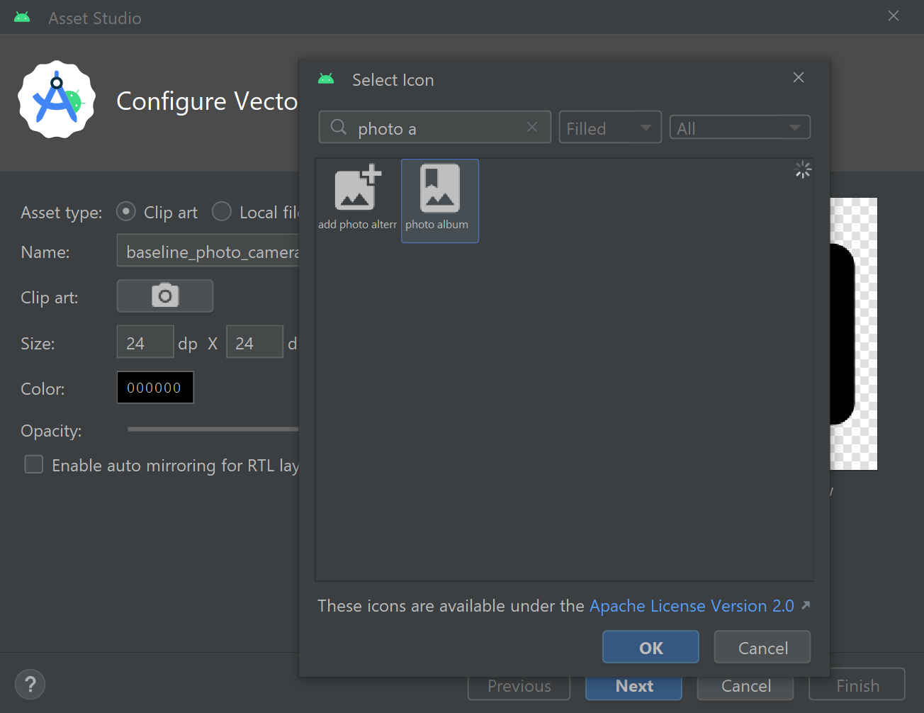
</androidx.constraintlayout.widget.ConstraintLayout>The above code begins by adding a PreviewView widget to the layout. The PreviewView widget is specially designed for displaying camera feeds using the CameraX library. It provides a surface for the camera feed to be drawn on and automatically adjusts to different camera properties such as the aspect ratio, scale and rotation. The layout also contains a FloatingActionButton widget, which will allow the user to capture photos. The FloatingActionButton will display a camera icon to indicate the role of the button. To create the camera icon, right-click the drawable folder (which is above the layout folder) then select New > Vector Asset.
In the Asset Studio window, click the image of the Android next to the phrase Clip Art to open a window called Select Icon.
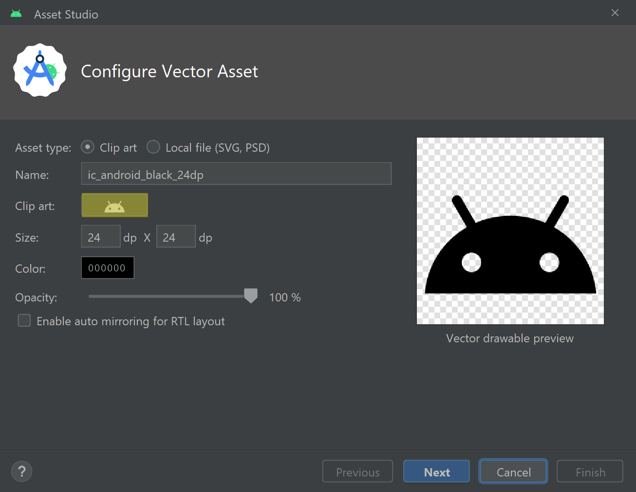
In the Select Icon window, search for and select the photo camera icon then press OK.
When you return to the Asset Studio window, set the name to ic_camera then press Next followed by Finish to save the icon. The layout for the camera fragment is now complete and ready for integration with the CameraFragment class. To do this, open the CameraFragment.kt file (Project > app > java > name of the project > ui > camera) and edit the _binding variable definition so it reads as follows:
private var _binding: FragmentCameraBinding? = nullNext, to initialise the _binding variable (and remove references to the deleted DashboardViewModel class), edit the onCreateView method so it reads as follows:
override fun onCreateView(
    inflater: LayoutInflater,
    container: ViewGroup?,
    savedInstanceState: Bundle?
): View {
    _binding = FragmentCameraBinding.inflate(inflater, container, false)

    return binding.root
}
The above code initialises the fragment_camera.xml layout’s binding class and allows the fragment to interact with the layout and its widgets.
Connecting to a camera and displaying a live feed
In this section, we’ll configure the camera fragment to capture photos using Android’s CameraX library. First, add the following variable below the binding variables at the top of the CameraFragment class:
private lateinit var cameraExecutor: ExecutorServiceThe cameraExecutor variable defined above will provide access to an instance of the ExecutorService class once initialised. The ExecutorService class is used to coordinate tasks. We will use the ExecutorService instance to manage actions relating to the camera, such as capturing photos. To initialise the cameraExecutor variable and load the camera feed, add the following code below the onCreateView method:
override fun onViewCreated(view: View, savedInstanceState: Bundle?) {
   super.onViewCreated(view, savedInstanceState)

   cameraExecutor = Executors.newSingleThreadExecutor()
   openCamera()
}
Note you may need to import the Executors class manually by adding the following import statement to the top of the file:
import java.util.concurrent.ExecutorsMoving on, we’ll now write a method called openCamera. The openCamera method will establish a connection with the camera and display a live camera feed. To define the method, add the following code below the onViewCreated method:
private fun openCamera() {
   if (MainActivity.CameraPermissionHelper.hasCameraPermission(requireActivity()) &&
       MainActivity.CameraPermissionHelper.hasStoragePermission(requireActivity())) {
       val cameraProviderFuture = ProcessCameraProvider.getInstance(requireActivity())

       cameraProviderFuture.addListener({
           val cameraProvider = cameraProviderFuture.get()
           val preview = Preview.Builder()
               .build()
               .also {
                   it.setSurfaceProvider(binding.cameraFeed.surfaceProvider)
               }

           val cameraSelector = CameraSelector.DEFAULT_BACK_CAMERA

           // TODO: Initialise the ImageCapture instance here

           try {
               cameraProvider.unbindAll()
               cameraProvider.bindToLifecycle(this, cameraSelector, preview)
           } catch (e: IllegalStateException) {
               Toast.makeText(requireActivity(), resources.getString(R.string.error_connecting_camera), Toast.LENGTH_LONG).show()
           }
       }, ContextCompat.getMainExecutor(requireActivity()))
   } else MainActivity.CameraPermissionHelper.requestPermissions(requireActivity())
}
The openCamera method begins by checking whether the app has permission to access the camera(s) and storage on the user’s device. If the app does not have permission, then permission is requested using the CameraPermissionHelper object found in the MainActivity class. Otherwise, the method proceeds to create an instance of the ProcessCameraProvider class. The ProcessCameraProvider instance will bind the device’s cameras with the app so that the app can interact with the cameras.
Once the ProcessCameraProvider instance is ready, the listener we register above will be notified and begin to execute tasks with the assistance of the ExecutorService class. First, we initialise the PreviewView widget’s surface provider. The surface provider will prepare a Surface interface for displaying a live preview feed from the camera. Next, we specify the camera that we would like to use. By default, the app will use the rear-facing camera on the back of the user’s device. You could use the front-facing camera instead by replacing DEFAULT_BACK_CAMERA with DEFAULT_FRONT_CAMERA.
Finally, any currently active camera sessions are closed using the ProcessCameraProvider class’s unbindAll command. This frees up the camera for our app to initiate a new binding session and begin displaying a live feed from the rear-facing camera to the PreviewView widget. These latter two operations are wrapped in a try/catch block to intercept any illegal state exceptions that may occur. For example, the bindToLifecycle method can throw an illegal state exception if the camera is already bound to another app or process. You can find all possible exceptions associated with the different methods by referring to the official Android documentation. For instance, the documentation for the bindToLifecyle method can be found here. If an illegal state exception is thrown, then the above code will display a toast notification advising that there was an error connecting to the camera.
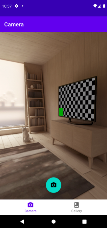
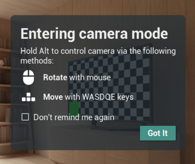
You can test the camera functionality on your computer using one of Android Studio’s virtual devices. For instructions on how to set up a virtual device, refer to our article ’How to run an Android app on a virtual device emulator’. To control the virtual device’s camera, hold the Alt key on your computer keyboard and move your mouse to look around the virtual room. You can also move around the virtual room by pressing the WASDQE keyboard keys. To capture a photo, click the floating action button that we added to the bottom of the fragment_camera.xml layout.
Capturing photos
In this section, we will explore how to use the camera to capture photos. The application will capture a photo when the user clicks the FloatingActionButton widget from the fragment_camera.xml layout. To configure this feature, add the following variable to the list of variables at the top of the CameraFragment class:
private lateinit var imageCapture: ImageCaptureThe variable defined above will store an instance of the ImageCapture class. The ImageCapture class handles actions relating to capturing photos using the CameraX library. We will want to initialise the ImageCapture instance once the app has successfully connected to a camera. To do this, locate the openCamera method and replace the TODO comment with the following code:
imageCapture = ImageCapture.Builder()
   .setCaptureMode(ImageCapture.CAPTURE_MODE_MINIMIZE_LATENCY)
   .build()
The above code builds an instance of the ImageCapture class and sets the capture mode of the instance to CAPTURE_MODE_MINIMIZE_LATENCY. The CAPTURE_MODE_MINIMIZE_LATENCY capture mode will minimise the capture latency and ensure photos are taken as quickly as possible. If you would prefer to prioritise image quality instead of capture speed, then you could use the capture mode CAPTURE_MODE_MAXIMIZE_QUALITY instead.
Similar to the camera feed preview, the image capture feature is another CameraX use case. For this reason, we must bind the ImageCapture instance to the CameraX lifecycle so it can be linked with the camera state. To do this, locate the section of the openCamera method where we run the bindToLifecycle method. Edit that line of code so it reads as follows to bind the ImageCapture instance to the CameraX lifecycle:
cameraProvider.bindToLifecycle(this, cameraSelector, preview, imageCapture)To initiate capture requests when the floating action button is clicked, add the following code to the onViewCreated method:
binding.fabTakePhoto.setOnClickListener {
   capturePhoto()
}
The above code registers an onClick listener to the FloatingActionButton widget, which runs a method called capturePhoto whenever the button is clicked. The capturePhoto method will capture a freeze-frame of the camera feed and save the resulting image to the user’s device. To define the capturePhoto method, add the following code below the openCamera method:
private fun capturePhoto() {
   if (!this::imageCapture.isInitialized) {
       Toast.makeText(requireActivity(), resources.getString(R.string.error_saving_photo), Toast.LENGTH_LONG).show()
       return
   }

   val contentValues = (activity as MainActivity).prepareContentValues()

   val outputFileOptions = ImageCapture.OutputFileOptions.Builder(
       requireActivity().applicationContext.contentResolver,
       MediaStore.Images.Media.EXTERNAL_CONTENT_URI,
       contentValues).build()

   imageCapture.takePicture(
       outputFileOptions, ContextCompat.getMainExecutor(requireActivity()), object : ImageCapture.OnImageSavedCallback {
           override fun onError(exc: ImageCaptureException) {
               Toast.makeText(requireActivity(), resources.getString(R.string.error_saving_photo), Toast.LENGTH_LONG).show()
           }

           override fun onImageSaved(output: ImageCapture.OutputFileResults) {
               Toast.makeText(requireActivity(), resources.getString(R.string.photo_saved), Toast.LENGTH_LONG).show()
           }
       })
}
The capturePhoto method begins by confirming that the imageCapture variable has been initialised. Remember, the imageCapture variable is initialised by the openCamera method once it successfully connects to the camera. If the user clicks the floating action button before a connection to the camera has been established, then the imageCapture variable will not be initialised and attempts to use it could cause the app to crash. For this reason, if the imageCapture variable is not initialised, then the method will display a toast notification advising that the app was unable to capture a photo. The return command will then exit the method without executing any further code.
Providing the imageCapture variable is initialised, the method will save the captured photo as an image file. The image file will require content values, which define data such as the file’s name and extension. The content values will be prepared by a MainActivity method that we will write shortly called prepareContentValues. The methodology for defining the content values is delegated to the MainActivity class so it can also be accessed by another fragment that we will create later. In defining the method in a place that can be accessed by both fragments, we help avoid the repetition of code (also known as boilerplate code), which is good software development practice.
Once all the content values have been prepared, they are packaged into an instance of the OutputFileOptions class. The ImageCapture instance will use the specifications detailed in the OutputFileOptions object to write the image file to the device’s storage and media store. The media store is a collection of tables detailing the different collections of media on the user’s device. For example, there are separate mediastore tables for music, images and videos. Each entry in the mediastore table is identified by a URI, which serves as a reference to the media item’s location on the device.
Finally, an image is captured from the camera using the ImageCapture class’s takePicture method and saved to the user’s device. The takePhoto method has two callback methods called onError and onImageSaved. The onError method will run if the app is unable to save the image, while the onImageSaved method will run if the image is saved successfully. In either case, the above code will display a toast notification advising the user accordingly. You can edit the above code if you would rather respond to successful and failed image capture attempts differently.
The image will be saved in PNG format to the DCIM folder on the user’s device, as specified in the image file’s content values. To assign content values to an image, we will write a method in the MainActivity class called prepareContentValues. Open the MainActivity.kt file (Project > app > java > name of the project) and add the following code below the onRequestPermissionsResult function:
fun prepareContentValues(): ContentValues {
   val timeStamp = SimpleDateFormat("yyyyMMdd_HHmmss", Locale.getDefault()).format(Date())
   val imageFileName = "image_$timeStamp"

   return ContentValues().apply {
       put(MediaStore.MediaColumns.DISPLAY_NAME, imageFileName)
       put(MediaStore.MediaColumns.MIME_TYPE, "image/png")
       put(MediaStore.MediaColumns.RELATIVE_PATH, "DCIM")
   }
}
Note you may need to add the following import statements to the top of the file:
import java.text.SimpleDateFormat
import java.util.Date
In the above code, content values are defined for the image’s display name, MIME type (the file format) and relative file path (DCIM directory). The file name is set to “image_” followed by a timestamp of when the photo was taken. The timestamp is determined using the SimpleDateFormat class, which uses the Date class to retrieve the current date and time (to the nearest millisecond) and formats the timestamp based on the structure "yyyyMMdd_HHmmss". For example, if the current time was 20 seconds past 11:34 AM on January 21st 2022 then the SimpleDateFormat class will output “20220121_113420”. The imageFileName variable incorporates the timestamp into the complete filename e.g. “image_20220121_113420”.
If you wish to provide further information about the image then you can use put commands as shown above. The put command requires you to specify a key, which identifies the content value, and the data associated with that key. For a list of possible keys you can refer to the official Android documentation.
Creating the Photo data class
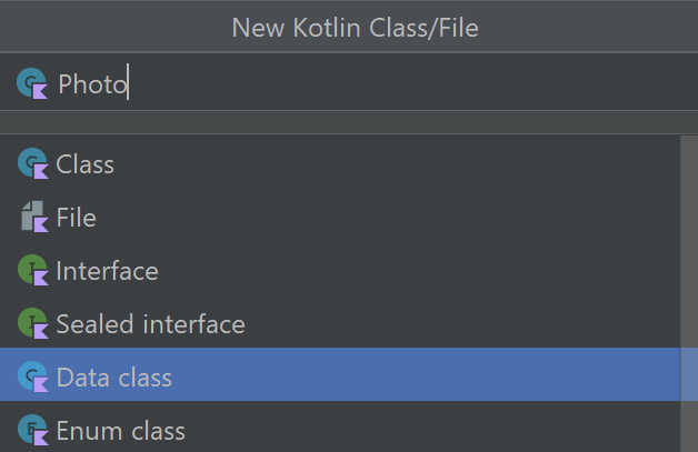
Besides capturing photos, the Camera app will also allow the user to view all the images on their device in a gallery. For processing purposes, information about each image will be packaged in a Kotlin data class. To create the data class, navigate through Project > app > java and right-click the folder with the project’s name. Next, select New > Kotlin File/Class.
Name the file Photo and select Data Class from the list of options.
A file called Photo.kt should then open in the editor. Modify the Photo class code so it reads as follows:
import kotlinx.parcelize.Parcelize

@Parcelize
data class Photo(val id: Long, val uri: Uri) : Parcelable
The Photo class defined above is labelled with the @Parcelize annotation and extends the Parcelable interface. Labelling the data class as parcelable means it can be packaged in a Parcel object for transportation between different areas of the app. The primary constructor of the data class contains two parameters, each storing a different piece of information. The id variable contains a Long numerical value which is unique to each Photo object, while the uri variable will contain a URI object that details the location of the image file.
Loading images from the user’s device
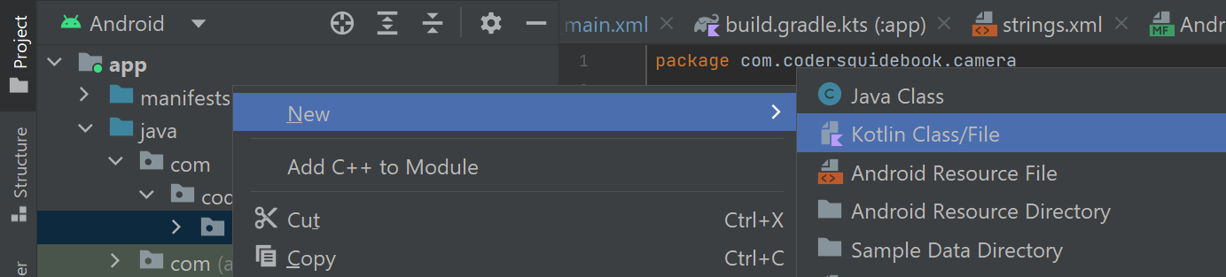
The image gallery will be coordinated by a view model. View models provide a way for applications to compartmentalise backend processes. For example, the view model we create here will load images from the device and handle requests to delete images. To create the class that will power the view model, right-click the folder with the name of the project (Project > app > java) then press New > Kotlin Class/File.
Name the class GalleryViewModel and select Class from the list of options. Once the GalleryViewModel.kt file opens in the editor, modify the contents of the class so it reads as follows:
class GalleryViewModel(application: Application) : AndroidViewModel(application) {

   private val appContext: Application = application
   private var contentObserver: ContentObserver
   val photos = MutableLiveData<List<Photo>>()

}
The GalleryViewModel class will inherit all the data and methods from the AndroidViewModel class. The AndroidViewModel class is a subclass of the ViewModel class; it incorporates all the functionality of the ViewModel class while also providing access to the application context. In the above code, the application context is stored in a variable called appContext so it can be used to access content on the device such as images. There is also a variable called contentObserver, which will monitor changes to the device’s content, and a variable called photos, which will contain a list of Photo objects representing the images stored on the user’s device. The list of Photo objects is classified as MutableLiveData. MutableLiveData can be observed by other areas of the app, which means those areas will be notified whenever the list of photos changes.
Let’s now make the view model operational. To do this, add the following code below the list of variables:
fun loadPhotos() = viewModelScope.launch(Dispatchers.IO) {
   val projection = arrayOf(MediaStore.Images.Media._ID)
   val selection = MediaStore.Images.Media.DATE_ADDED
   val sortOrder = "${MediaStore.Images.Media.DATE_ADDED} DESC"

   appContext.contentResolver.query(
           MediaStore.Images.Media.EXTERNAL_CONTENT_URI,
           projection,
           selection,
           null,
           sortOrder
   )?.use { cursor ->
       photos.postValue(addPhotosFromCursor(cursor))
   }
}
The loadPhotos method will scan the user’s device for photos. This could be an energy-intensive and lengthy process and so we must consider what the optimum method for completing the task is. To complete complex tasks in a resource-efficient manner, we can use a Kotlin feature called coroutines. Coroutines provide a mechanism for completing complex tasks behind the scenes by allocating tasks to alternative worker threads. By default, most tasks will be completed on the main thread of the app; however, if too much work is performed on the main thread it can cause the application to slow down and freeze. For this reason, it is advantageous to use coroutines to complete complex tasks without compromising performance.
The loadPhotos method is launched using a view model scope, which is a custom coroutine scope owned by the view model. If the view model is closed, then any outstanding tasks launched via the view model scope will be cancelled. The coroutine defined above also utilises the IO dispatcher. The IO dispatcher directs tasks to a pool of threads geared towards handling data input and output, which is perfect for the loadPhotos method because it will be processing image files.
The loadPhotos method will locate all the images on the user’s device via a content query. The content query comprises multiple components. First, we must set the projection, which defines the columns that should be included in the table of results. In the above code, the projection will return only the ID of each image because this is all we need to locate the image’s file. You could request additional data such as the display name of the image and the date it was taken. For more information on this, refer to the Android documentation to find the column names. The content query also includes a selection argument, which will filter the results. In the above code, the selection criterion will sort the images based on when they were added to the device. This will allow us to sort the results from newest to oldest so the user will see their most recent photos first.
The results of the query are returned as a Cursor interface table, which the app can iterate over row-by-row to find the details of each image on the user’s device. This processing will be handled by a method called addPhotosFromCursor which will use the results in the Cursor to create a corresponding list of Photo objects. To define the addPhotosFromCursor method, add the following code below the loadPhotos method:
private fun addPhotosFromCursor(cursor: Cursor): List<Photo> {
   val photoList = mutableListOf<Photo>()

   while (cursor.moveToNext()) {
       val id = cursor.getLong(0)
       val contentUri = ContentUris.withAppendedId(MediaStore.Images.Media.EXTERNAL_CONTENT_URI, id)

       val photo = Photo(id, contentUri)
       photoList += photo
   }

   return photoList
}
The addPhotosFromCursor method will use a mutable list called photoList to store the Photo objects that are generated based on the data in the Cursor. The results are iterated over using the Cursor class’s moveToNext method. For each result, we extract the image’s ID using the getLong command because the ID is stored in Long format. The Cursor only contains one column (as specified in the projection in the loadPhotos method) so we know the ID column index will be 0. Next, the ID of each image is used to build a content URI that identifies the image in the device’s media store. For example, image content URIs often take the format content://media/external/images/media/ID, where ‘ID’ represents the image’s ID number. The image ID and content URI are then packaged into a Photo object and added to the photoList variable. Once all the results in the Cursor have been processed, the addPhotosFromCursor method returns the full list of Photo objects to the loadPhotos method so it can be made available to the wider app.
The app is now capable of generating a list of Photo objects representing the images on the user’s device. However, it is important to consider that the collection of images may change as old images are deleted and new ones are created. To detect and respond to changes we must register a content observer, The content observer will monitor and respond to changes to the collection of images on the user’s device. To implement the content observer when the view model is initialised, add the following code below the list of variables at the top of the GalleryViewModel class:
init {
   contentObserver = getApplication<Application>().contentResolver.registerObserver(MediaStore.Images.Media.EXTERNAL_CONTENT_URI) {
       loadPhotos()
   }
}
Next, add the following code below the addPhotosFromCursor method to direct the content observer to monitor the images on the user’s device:
private fun ContentResolver.registerObserver(
       uri: Uri,
       observer: (selfChange: Boolean) -> Unit
): ContentObserver {
   val contentObserver = object : ContentObserver(Handler(Looper.getMainLooper()
)) {
       override fun onChange(selfChange: Boolean) {
           observer(selfChange)
       }
   }
   registerContentObserver(uri, true, contentObserver)
   return contentObserver
}
Note you may need to add the following import statement to the top of the file:
import android.os.HandlerThe registerObserver method will direct the content observer to monitor changes to files that feature an Images MediaStore content URI. If a change occurs (e.g. an image is added, updated or deleted) then the loadPhotos method will run. In this way, the list of Photo objects held by the app will update to reflect the changes.
When the view model is closed, we should unregister the content observer to prevent memory leaks and any unnecessary use of the device’s computational resources. To unregister the content observer, add the following code below the addPhotosFromCursor method:
override fun onCleared() {
   appContext.contentResolver.unregisterContentObserver(contentObserver)
}
The onCleared method defined above refers to a stage of the ViewModel class lifecycle that runs when the view model is no longer being used and is in the process of shutting down. In this event, the above code will unregister the content observer and prevent it from continuing to monitor the images on the user’s device.
Setting up the Gallery fragment and layout
The image gallery will be displayed using a dedicated fragment, which will require a layout. To create the layout navigate through Project > app > res then right-click the layout folder and select New > Layout Resource File.
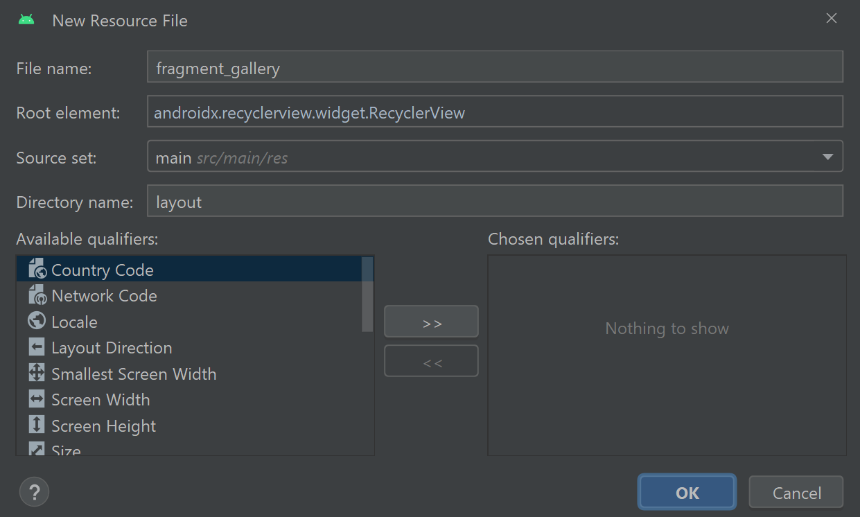
Name the file fragment_gallery and set the root element to androidx.recyclerview.widget.RecyclerView, then press OK.
Android Studio should then create a layout that contains a solitary RecyclerView widget. The RecyclerView widget will occupy the entire layout and display previews of every image stored on the user’s device. To load the image previews, we must first initialise the RecyclerView widget. To do this, locate and open the GalleryFragment.kt file by navigating through Project > app > java > name of the project > ui > gallery. Next, amend the _binding variable so it reads as follows and imports the gallery fragment layout binding class:
private var _binding: FragmentGalleryBinding? = nullAlso, add the following variable to provide access to the GalleryViewModel class:
private lateinit var viewModel: GalleryViewModelTo initialise the fragment_gallery layout’s binding class and the GalleryViewModel view model, edit the onCreateView method so it reads as follows:
override fun onCreateView(
   inflater: LayoutInflater,
   container: ViewGroup?,
   savedInstanceState: Bundle?
): View {
   _binding = FragmentGalleryBinding.inflate(inflater, container, false)
   viewModel = ViewModelProvider(this)[GalleryViewModel::class.java]
   return binding.root
}
Once the fragment_gallery layout is available, we should initialise the GalleryViewModel view model. To arrange this, add the following code below the onCreateView method:
override fun onViewCreated(view: View, savedInstanceState: Bundle?) {
   super.onViewCreated(view, savedInstanceState)

   // TODO: Apply the adapter to the RecyclerView

   viewModel.photos.observe(viewLifecycleOwner) { photos ->
       // TODO: Load the photo previews here
   }

   if (MainActivity.CameraPermissionHelper.hasStoragePermission(requireActivity())) viewModel.loadPhotos()
   else MainActivity.CameraPermissionHelper.requestPermissions(requireActivity())
}
The above code registers an observer on the view model’s photos variable. The observer allows the fragment to monitor the contents of the variable and respond to changes in real time. The remaining code uses the CameraPermissionHelper object in the MainActivity class to check whether the app has permission to access the device’s storage. If permission has been granted, then the GalleryViewModel view model’s loadPhotos method will retrieve the list of images on the user’s device. Otherwise, the CameraPermissionHelper object will request the necessary permissions from the user.
Displaying image previews
In this section, we will design and implement an adapter that will load a preview of each image on the user’s device into the RecyclerView widget found in the fragment_gallery.xml layout. To facilitate this, we first need to create a layout file that will display each image preview. Create a new layout resource file in the usual way, by right-clicking the layout directory (found by navigating Project > app > res) then selecting New > Layout Resource File.
Name the layout image_preview then press OK. Once the layout opens in the editor, switch to Code view and edit the contents of the file so it reads as follows:
<?xml version="1.0" encoding="utf-8"?>
<androidx.constraintlayout.widget.ConstraintLayout xmlns:android="http://schemas.android.com/apk/res/android"
   xmlns:app="http://schemas.android.com/apk/res-auto"
   android:layout_width="match_parent"
   android:layout_height="wrap_content">

   <ImageView
       android:id="@+id/image"
       android:layout_width="match_parent"
       android:layout_height="0dp"
       android:foreground="?attr/selectableItemBackground"
       android:contentDescription="@string/image"
       app:layout_constraintTop_toTopOf="parent"
       app:layout_constraintDimensionRatio="1:1" />
</androidx.constraintlayout.widget.ConstraintLayout>
The above code defines an ImageView widget that will display an image from the user’s device. The ImageView widget contains a foreground attribute set to selectableItemBackground, which means a ripple effect will appear when the widget is pressed. The ripple effect will show the user which image they are selecting. The ImageView also contains a constraint dimension ratio of 1:1, a width set to occupy the maximum available space and a height set to 0dp. Altogether, these attributes mean the ImageView widget will occupy the maximum available width and the height will be the same length as the width, thereby ensuring the ImageView is square-shaped.
Moving on, let’s create the adapter class that will coordinate the list of images loaded into the RecyclerView widget. Right-click the gallery directory then select New > Kotlin Class/File. Name the file GalleryAdapter and select Class from the list of options. Once the GalleryAdapter.kt file opens in the editor modify its contents so it reads as follows:
class GalleryAdapter(private val activity: MainActivity, private val fragment: GalleryFragment):
       RecyclerView.Adapter<RecyclerView.ViewHolder>() {

   var photos = listOf<Photo>()

   inner class GalleryViewHolder(itemView: View) :
           RecyclerView.ViewHolder(itemView) {

       internal var image = itemView.findViewById<View>(R.id.image) as ImageView

       init {
           itemView.isClickable = true
           itemView.setOnClickListener {
               // TODO: Navigate to the photo filter fragment
           }

           itemView.setOnLongClickListener {
              // TODO: Open the popup menu
              return@setOnLongClickListener true
           }
       }
   }

   override fun onCreateViewHolder(parent: ViewGroup, viewType: Int): RecyclerView.ViewHolder {
       return GalleryViewHolder(LayoutInflater.from(parent.context).inflate(R.layout.image_preview, parent, false))
   }

   override fun onBindViewHolder(holder: RecyclerView.ViewHolder, position: Int) {
       holder as GalleryViewHolder
       val current = photos[position]

       Glide.with(activity)
               .load(current.uri)
               .centerCrop()
               .into(holder.image)
   }

   override fun getItemCount(): Int {
       return photos.size
   }
}
Note you may need to add the following import statement to the top of the class to import the Photo data class we created earlier (edit ‘com.example.camera’ to reflect the package name of your project as stated on line 1 of the file):
import com.example.camera.PhotoThe GalleryAdapter class’s primary constructor contains parameters called activity and fragment. The parameter values will link to the MainActivity and GalleryFragment classes and allow the adapter to access their data and methods. In the body of the adapter, a variable called photos will hold the list of Photo objects generated by the GalleryViewModel view model. There is also an inner class called GalleryViewHolder. The GalleryViewHolder inner class will initialise the components of the image_preview.xml layout and handle user interactions. The adapter knows to use the image_preview.xml layout for displaying items in the RecyclerView because this is the layout returned by the onCreateViewHolder method.
The next method in the adapter is called onBindViewHolder and determines how data is displayed at each position in the RecyclerView. It does this by finding the corresponding Photo object in the photos list for the current position in the RecyclerView and then assigning the Photo object to a variable called current. Next, an image-loading framework called Glide retrieves the image file based on the content URI stored in the Photo object and loads it into the ImageView from the image_preview.xml layout. In the above code, we also direct Glide to crop the image if necessary to make it fit in the ImageView widget.
Once the adapter is set up, we can integrate it with the gallery fragment and apply it to the RecyclerView widget. To do this, open the GalleryFragment.kt file and add a variable for the GalleryAdapter class to the list of variables at the top of the class:
private lateinit var adapter: GalleryAdapterNext, locate the TODO comment in the onViewCreated method that says to apply the adapter to the RecyclerView widget and replace the comment with the following code:
adapter = GalleryAdapter(activity as MainActivity, this)
binding.root.layoutManager = GridLayoutManager(context, 3)
binding.root.adapter = adapter
The above code initialises the GalleryAdapter adapter and binds the adapter to the RecyclerView so the adapter can interact with the RecyclerView and update its contents. A GridLayoutManager instance with a span count of 3 is also applied to the RecyclerView. The GridLayoutManager will direct the RecyclerView to display items in a grid containing three columns. To load the list of Photo objects into the adapter, locate the section of code where the observer is registered on the gallery view model’s photos variable and replace the TODO comment with the following code:
adapter.notifyItemRangeRemoved(0, adapter.itemCount)
adapter.photos = photos
adapter.notifyItemRangeInserted(0, photos.size)
The above code directs the observer to send the list of Photo objects from the gallery view model to the adapter’s photos variable. The observer will do this whenever there is a change to the contents of the gallery view model’s photos variable, which means the adapter will be notified whenever photos are added or deleted. The observer uses the adapter’s notifyItemRangeRemoved and notifyItemRangeInserted methods to refresh the gallery with the new set of images.
Deleting an image from the MediaStore
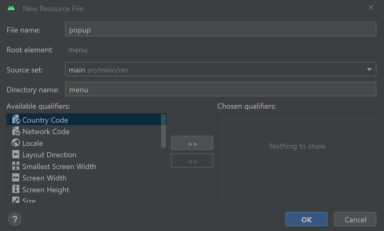
The Camera app will allow the user to delete images if they wish. To do this, the user simply needs to long-click an image preview and a popup menu will appear inviting the user to delete the image. To create the popup menu, navigate through Project > app > res and right-click the menu directory. Next, select New > Menu Resource File, name the file popup and press OK.
Switch the file to Code view and add the following item element between the opening and closing menu tags:
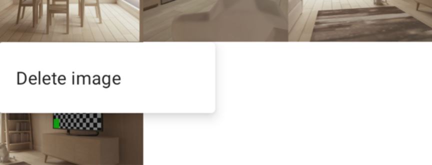
<item android:id="@+id/popup_delete"
   android:title="@string/delete_image" />
This menu item has an ID set to popup_delete and will display the text “Delete image”. When the user clicks the menu item, it will begin the process of deleting the selected image from the user’s device.
The popup menu will open when the user long presses an image preview in the gallery fragment’s RecyclerView. To enable this functionality, open the GalleryAdapter.kt file and replace the TODO comment inside the onLongClickListener of the GalleryViewHolder inner class with the following code:
fragment.showPopup(it, photos[layoutPosition])The above code will run a GalleryFragment method called showPopup. The showPopup method will display the popup menu and invite the user to delete the image. To define the showPopup method, open the GalleryFragment.kt file and add the following code below the onViewCreated method:
fun showPopup(view: View, photo: Photo) {
   PopupMenu(requireActivity(), view).apply {
       inflate(R.menu.popup)
       setOnMenuItemClickListener {
           if (it.itemId == R.id.popup_delete) {
               deletePhoto(photo)
           }
           true
       }
       show()
   }
}
You may need to manually add the following import statements to the top of the file:
import androidx.appcompat.widget.PopupMenu
import com.example.camera.Photo
The showPopup method uses the PopupMenu class to create a popup menu that appears over a given View. In this case, the View will be the ImageView widget that the user has selected. The actions that occur when a menu item is clicked are specified in the OnMenuItemClickListener callback function. In this case, there is only one menu item and it is called popup_delete. If the popup_delete menu item is clicked, then a method called deletePhoto will attempt to delete the user’s selected image.
Requests to delete media files are sent to the device using an ActivityResultLauncher. ActivityResultLauncher instances must be registered when the fragment is created, so we can not define them ad hoc in methods for example. To define an ActivityResultLauncher that will handle requests to delete image files, add the following variable to the top of the GalleryFragment class:
private val launcher = registerForActivityResult(ActivityResultContracts.StartIntentSenderForResult()) {
       result: ActivityResult ->
   if (result.resultCode == Activity.RESULT_OK) {
       Toast.makeText(requireContext(), getString(R.string.photo_deleted), Toast.LENGTH_LONG).show()
   }
}
Note you may need to add the following import statement to the top of the file:
import androidx.activity.result.ActivityResultThe above code generates an ActivityResultLauncher instance using a method called registerForActivityResult. The ActivityResultLauncher instance will submit the deletion request and process the result. In this case, we check whether the result code is Activity.RESULT_OK. A toast notification then informs the user that the photo was successfully deleted. The gallery will also update as the content observer we defined earlier in the GalleryViewModel view model will detect the deleted file.
To prepare and submit the image deletion request, add the following code below the showPopup method:
private fun deletePhoto(photo: Photo) {
val intentSender = MediaStore.createDeleteRequest(requireActivity().applicationContext.contentResolver,
listOf(photo.uri)).intentSender
val intentSenderRequest = IntentSenderRequest.Builder(intentSender).build()
launcher.launch(intentSenderRequest)
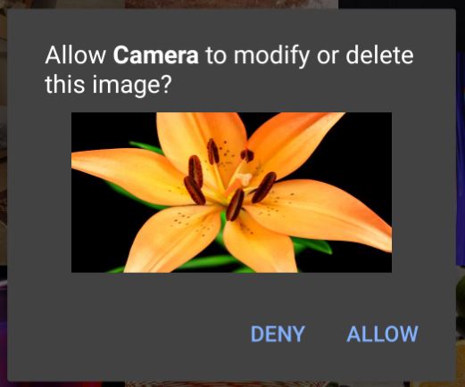
}The deletePhoto method extracts the content URI from the supplied Photo object and packages it in an IntentSender instance. The IntentSender instance will request the device delete the image file associated with the content URI. An IntentSender is prepared and launched using an ActivityResultLauncher because all applications must adhere to scoped storage guidelines since Android 10.0 (API 29). Scoped storage is a framework that restricts an application’s access to files it did not create and is designed to protect the user’s privacy. If user permission is required to complete the request, then the device will prompt the user accordingly.
Setting up the Photo Filter fragment
The Camera application will have a feature that enables the user to apply a readymade set of filters to their images. This functionality will be handled by a dedicated fragment. To create the fragment, right-click the gallery ui directory then select New > Fragment > Fragment (Blank).
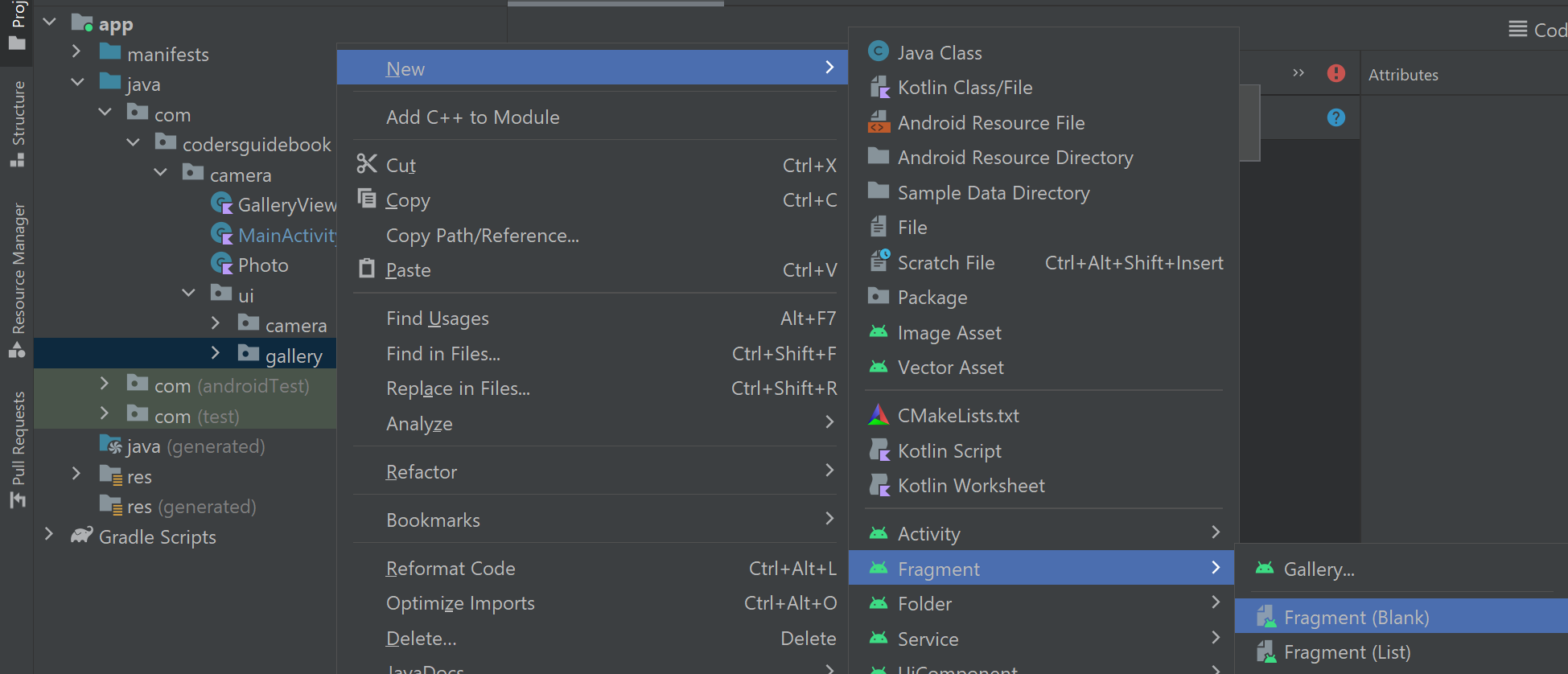
In the New Android Component window that opens, set the fragment name to PhotoFilterFragment and use fragment_photo_filter as the layout name. Next, press Finish and Android Studio should then create a Kotlin class and XML layout file for the new fragment.
Let’s design the layout first. Open the fragment_photo_filter.xml layout in Code view and edit its contents so it reads as follows:
<?xml version="1.0" encoding="utf-8"?>
<androidx.constraintlayout.widget.ConstraintLayout xmlns:android="http://schemas.android.com/apk/res/android"
   xmlns:app="http://schemas.android.com/apk/res-auto"
   android:layout_width="match_parent"
   android:layout_height="match_parent">

   <ImageView
       android:id="@+id/selectedImage"
       android:layout_width="match_parent"
       android:layout_height="0dp"
       android:contentDescription="@string/image"
       app:layout_constraintDimensionRatio="1:1"
       app:layout_constraintTop_toTopOf="parent" />

   <Spinner
       android:id="@+id/filterSpinner"
       android:layout_width="wrap_content"
       android:layout_height="wrap_content"
       android:layout_marginTop="12dp"
       app:layout_constraintStart_toStartOf="parent"
       app:layout_constraintEnd_toEndOf="parent"
       app:layout_constraintTop_toBottomOf="@id/selectedImage" />
</androidx.constraintlayout.widget.ConstraintLayout>
The fragment_photo_filter.xml layout contains two widgets. The first widget is an ImageView that will display the user’s selected image. The ImageView will occupy the maximum available width. Its height will equal the width because the constraint dimension ratio used is 1:1. In this way, we ensure the image will appear as a square. The second widget is a Spinner. The Spinner will display the list of available filters.
With the layout now in place, let’s turn our attention to the PhotoFilterFragment class. Android Studio will likely have automatically generated a lot of code when the fragment was created. Much of this code is not applicable for our purposes so delete all the code except the package declaration on line 1. Next, add the following code to the file to define the class and initialise the fragment_photo_filter layout’s binding class:
import com.example.camera.Photo

class PhotoFilterFragment : Fragment() {

   private var _binding: FragmentPhotoFilterBinding? = null
   private val binding get() = _binding!!
   private var photo: Photo? = null

   override fun onCreateView(
       inflater: LayoutInflater,
       container: ViewGroup?,
       savedInstanceState: Bundle?
   ): View {
       _binding = FragmentPhotoFilterBinding.inflate(inflater, container, false)
       return binding.root
   }

   override fun onViewCreated(view: View, savedInstanceState: Bundle?) {
       super.onViewCreated(view, savedInstanceState)

       loadImage(null)
   }

   override fun onDestroyView() {
       super.onDestroyView()
       _binding = null
   }
}
The photo filter fragment also contains a variable called photo, which will store the Photo object associated with the user’s selected image. The image will be displayed using a method called loadImage. To define the loadImage method, add the following code below the onViewCreated method:
private fun loadImage(glideFilter: Transformation<Bitmap>?) {
    when {
        photo != null && glideFilter != null -> {
            Glide.with(this)
                .load(photo!!.uri)
                .transform(
                    CenterCrop(),
                    glideFilter
                )
                .diskCacheStrategy(DiskCacheStrategy.NONE)
                .into(binding.selectedImage)
        }
        photo != null -> {
            Glide.with(this)
                .load(photo!!.uri)
                .centerCrop()
                .diskCacheStrategy(DiskCacheStrategy.NONE)
                .into(binding.selectedImage)
        }
    }
}
Note you may need to add the following import statement to the top of the file:
import com.bumptech.glide.load.TransformationThe loadImage method has an argument called glideFilter that will accept a Transformation object. The Transformation object details a filter that should be applied to the image. If the image should be displayed without a filter, then a null value should be supplied for the glideFilter argument. The loadImage method uses a when block to respond to different use-case scenarios. First, if both the Photo and Transformation objects are not null then Glide will load the image and use its transform command to apply the user’s selected filter. The filters are provided by an external library called Glide Transformations, which you can read about on GitHub. Meanwhile, the second scenario in the when block will run when a Photo object is provided but the glideFilter parameter is null. In this case, Glide is directed to load the image without applying a transformation, which will restore an unfiltered version of the image.
It is noteworthy that we instruct Glide to implement a DiskCacheStrategy of NONE. Typically, Glide will attempt to store a cache of images in the device’s memory to make it easier to load those images again in future. In this instance, we disable the cache feature because each image must be reloaded from scratch whenever a filter is applied or removed. Otherwise, Glide may load a previous version of the image rather than one with the filter applied.
Navigating to the photo filter fragment
For the photo filter fragment to load the user’s selected image, we must communicate their selection from the gallery fragment to the photo filter fragment. To send data between fragments, we will use the Safe Args plugin. The Safe Args plugin creates a custom class for each destination that can transport data during navigation events.
Each item of data that is transmitted during navigation must be defined in the app’s navigation graph. The navigation graph details the network of destinations throughout the app. To locate the navigation graph, navigate through Project > app > res > navigation and open the file called mobile_navigation.xml. To define the destinations that the Camera app will use, switch the navigation graph to Code view and replace the code between the opening and closing navigation tags with the following:
<fragment
   android:id="@+id/nav_camera"
   android:name="com.example.camera.ui.camera.CameraFragment"
   android:label="@string/camera"
   tools:layout="@layout/fragment_camera" />

<fragment
   android:id="@+id/nav_gallery"
   android:name="com.example.camera.ui.gallery.GalleryFragment"
   android:label="@string/gallery"
   tools:layout="@layout/fragment_gallery">

   <action
       android:id="@+id/actionPhotoFilter"
       app:destination="@id/nav_photo_filter" />
</fragment>

<fragment
   android:id="@+id/nav_photo_filter"
   android:name="com.example.camera.ui.gallery.PhotoFilterFragment"
   android:label="Edit photo"
   tools:layout="@layout/fragment_photo_filter" >
   <argument
       android:name="photo"
       android:defaultValue="@null"
       app:argType="com.example.camera.Photo"
       app:nullable="true" />
</fragment>
The above code defines separate destinations for the camera, gallery and photo filter fragments. Each destination contains an ID attribute, which identifies the destination in the navigation graph; a name attribute that specifies the location of the destination; a label that will be displayed in the app toolbar when the destination is active; and the layout file which will be used for that destination.
Destinations are linked through actions. For example, the gallery fragment has an action that leads to the photo filter fragment because the user can navigate from the gallery fragment to the photo filter fragment by clicking one of the image previews. Each action must include an ID, which is used to reference and initiate the action, and a destination attribute that contains the ID of the target destination. To see a graphical representation of the navigation network, switch the navigation graph to Design view and notice the arrow from the gallery fragment to the photo filter fragment. The arrow represents that there is an action leading from one fragment to the other.
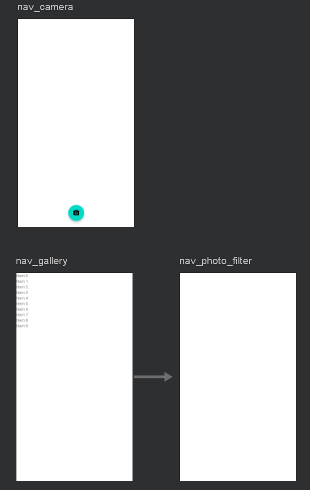
Data can be transmitted from one destination to another using the Safe Args plugin. The data type that can be transmitted is defined as an argument for the target destination. For example, the photo filter fragment accepts a Photo object as an argument. The Photo object will be supplied by the gallery fragment when the user selects an image preview. When defining an argument, you must assign it a name and a default value, and specify the data type (argType). You can also state whether the argument is nullable. If an argument is nullable, then the argument value can be null rather than a value of the corresponding data type. We’re almost finished with the navigation graph. The last change we need to make is to set the start destination. The start destination is the origin of the navigation graph and the first destination the user will see when the app loads. To set the origin-destination to the camera fragment, edit the startDestination attribute of the opening navigation tag so it reads as follows:
app:startDestination="@+id/nav_camera"Moving on, let’s implement the action that transports the user from the gallery fragment to the photo filter fragment. To do this, open the GalleryAdapter.kt file (Project > app > java > name of the project > ui > gallery) and locate the onClick listener in the GalleryViewHolder inner class. The onClick listener should contain a TODO comment. Replace the comment with the following code:
val action = GalleryFragmentDirections.actionPhotoFilter(photos[layoutPosition])
it.findNavController().navigate(action)
The above code uses the GalleryFragmentDirections class (that was generated by the Safe Args plugin) to access the actions that originate from the gallery fragment destination. In this instance, we will use the actionPhotoFilter action that leads to the photo filter fragment. The photo filter fragment destination accepts a Photo object as an argument, and so the Photo object associated with the user’s selection is included in the action. Once the action has been prepared, we instruct the navigation controller to initiate it and transport the user to the photo filter fragment along with the corresponding Photo object for their selected image.
Finally, let’s prepare the photo filter fragment to receive the incoming Photo object. Open the PhotoFilterFragment.kt file (Project > app > java > name of the project > ui > gallery) and add the following code to the beginning of the onCreateView method:
arguments?.let {
   val safeArgs = PhotoFilterFragmentArgs.fromBundle(it)
   photo = safeArgs.photo
}
The above code retrieves the arguments that are supplied when the photo filter fragment is created. To extract an argument’s value, simply search the fragment’s Safe Args class for a property that shares the same name as the argument. Referring back to the navigation graph, we can see the photo filter fragment’s argument is called photo. In the above code, the Photo object associated with the photo argument is transferred to a variable so it can be used elsewhere in the fragment.
Applying filters to a photo
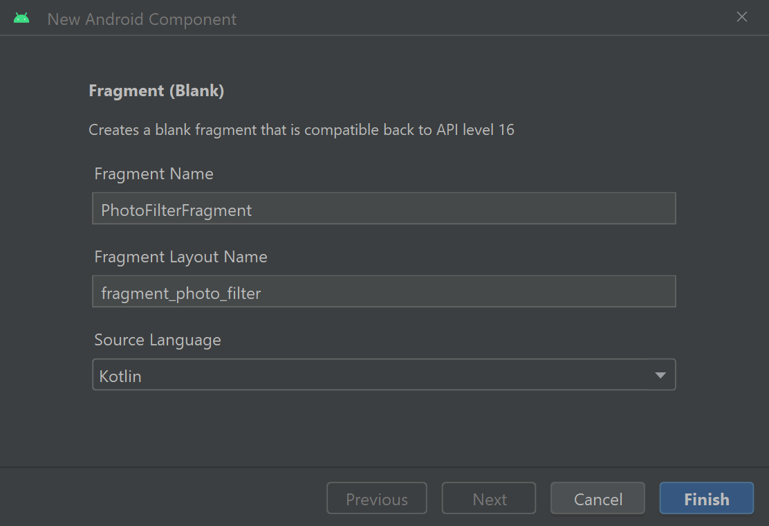
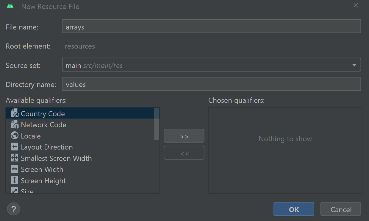
The photo filter fragment will allow the user to apply filters to their selected image. The range of available filters will be listed in a spinner widget, which will draw the list of options from an array resource. To create the array resource, right-click the values directory (Project > app > res) then select New > Values Resource File. Name the file arrays then press OK to create a resource file called arrays.xml.
Add the following code between the opening and closing resource tags to define an array of strings called filters_array. Each item in the array contains the name of a different filter the user can select.
<string-array name="filters_array">
   <item>None</item>
   <item>Greyscale</item>
   <item>Swirl</item>
   <item>Invert filter</item>
   <item>Kuwahara filter</item>
   <item>Sketch filter</item>
   <item>Toon filter</item>
</string-array>
To apply the string array to the spinner, return to the PhotoFilterFragment.kt file (b>Project > app > java > name of the project > ui > gallery) and add the following code to the bottom of the onViewCreated method:
// Create an ArrayAdapter using the string array and a default spinner layout
ArrayAdapter.createFromResource(
       requireActivity(),
       R.array.filters_array,
       android.R.layout.simple_spinner_item
).also { adapter ->
   // Specify the layout to use when the list of choices appears
   adapter.setDropDownViewResource(android.R.layout.simple_spinner_dropdown_item)
   // Apply the adapter to the spinner
   binding.filterSpinner.adapter = adapter
}
The above code creates an instance of the ArrayAdapter class, which is a class that displays and presents data in widgets such as ListViews and Spinners. In this case, we use the ArrayAdapter class to load the filter array and present its contents using Android’s default layout for Spinner items. The ArrayAdapter instance is then applied to the Spinner widget from the fragment_photo_filter.xml layout so the user can select their preferred filter.
Next, let’s define what actions will happen when an item is selected. To do this, add the following code below the ArrayAdapter instance:
binding.filterSpinner.onItemSelectedListener = object : AdapterView.OnItemSelectedListener {
   override fun onItemSelected(
           parent: AdapterView<*>?,
           view: View?,
           position: Int,
           id: Long
   ) {
       val filter = parent?.getItemAtPosition(position).toString()
       applyFilter(filter)
   }

   override fun onNothingSelected(parent: AdapterView<*>?) { }
}
The above code applies an onItemSelected listener to the Spinner. When the user selects an item, the listener’s onItemSelected callback function will retrieve the name of the filter based on the selected item’s position in the filter array. Next, a method called applyFilter will apply the selected filter to the image. OnItemSelected listeners also require you to define an onNothingSelected callback function that runs when the user unselects an item or the selected item disappears from the adapter. In this app, we will not utilise the onNothingSelected function so it is left empty. Moving on, let’s define the applyFilter method. The applyFilter method will transform the image based on the user’s filter selection. To define the applyFilter method, add the following code below the loadImage method:
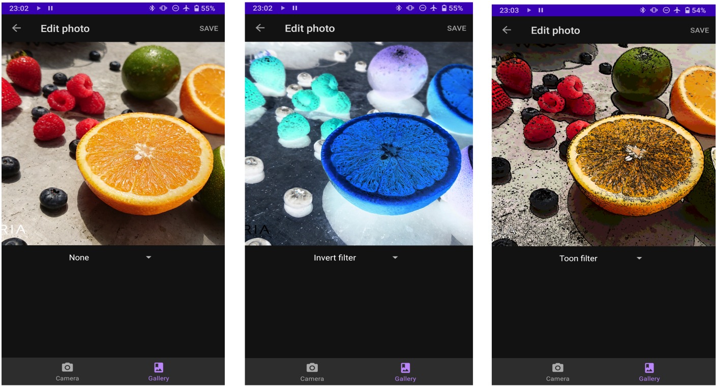
private fun applyFilter(filter: String?) {
   when (filter) {
       "None" -> loadImage(null)
       "Greyscale" -> loadImage(GrayscaleTransformation())
       "Swirl" -> loadImage(SwirlFilterTransformation(0.5f, 1.0f, PointF(0.5f, 0.5f)))
       "Invert filter" -> loadImage(InvertFilterTransformation())
       "Kuwahara filter" -> loadImage(KuwaharaFilterTransformation(25))
       "Sketch filter" -> loadImage(SketchFilterTransformation())
       "Toon filter" -> loadImage(ToonFilterTransformation())
   }
}
The applyFilter method uses a when block to apply the selected filter to the image. The classes which generate the filter effects are retrieved from a transformation library called Glide Transformations made by Daichi Furiya. You can read more about this library on the project’s GitHub page. The corresponding filter class for the user’s selection is sent to the loadImage method, which applies the filter to the image as described in the previous section called ‘Setting up the Photo Filter fragment’. If the user selects the “None” item from the Spinner, then the loadImage method will display the original unfiltered image.
Saving the image once a filter has been applied
In this section, we will explore how to save the content of an ImageView widget to the user’s device as an image file. For example, there will be a “save” menu item in the toolbar of the photo filter fragment that allows the user to save the filtered image. To build the menu, navigate through Project > app > res and right-click the menu directory. Select New > Menu Resource File, name the file main and press OK.
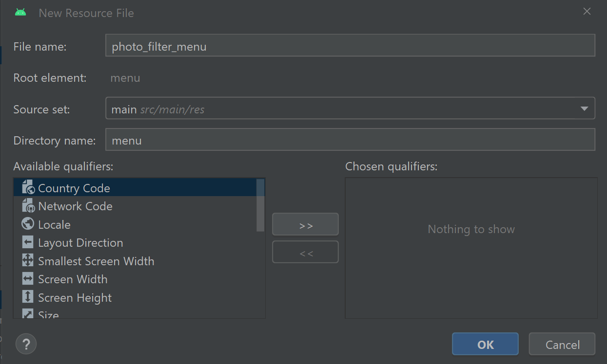
The photo_filter_menu.xml menu file will then open in the editor. Switch the file to Code view and edit its contents so it reads as follows:
<?xml version="1.0" encoding="utf-8"?>
<menu xmlns:android="http://schemas.android.com/apk/res/android"
   xmlns:app="http://schemas.android.com/apk/res-auto">

   <item android:id="@+id/save"
       android:title="@string/save"
       app:showAsAction="ifRoom" />
</menu>
The above code defines a menu item called save. The menu item’s showAsAction attribute is set to ifRoom, which means the full menu item will appear in the app toolbar, providing there is enough space. Otherwise, the menu item will be accessible through the overflow menu.
To make the menu operational, return to the PhotoFilterFragment.kt file and add the following code to the bottom of the onViewCreated method:
setupMenu()The above line of code calls a method called setupMenu, which will configure the menu. To define the setupMenu method, add the following code below the applyFilter method:
private fun setupMenu() {
   (requireActivity() as MenuHost).addMenuProvider(object : MenuProvider {
       override fun onCreateMenu(menu: Menu, menuInflater: MenuInflater) {
           menuInflater.inflate(R.menu.photo_filter_menu, menu)
       }

       override fun onMenuItemSelected(menuItem: MenuItem): Boolean {
           when (menuItem.itemId) {
               android.R.id.home -> findNavController().popBackStack()
               R.id.save -> {
                   val image = getBitmapFromView(binding.selectedImage)
                   (activity as MainActivity).saveImage(image)
               }
               else -> return false
           }
           return true
       }
   }, viewLifecycleOwner, Lifecycle.State.RESUMED)
}
Note you may need to add the following import statements to the top of the file:
import androidx.navigation.fragment.findNavController
import androidx.lifecycle.Lifecycle
The above code defines a MenuProvider instance that features various callback methods for coordinating an options menu. First, the onCreateMenu method uses the MenuInflater class to initialise the photo_filter_menu.xml menu resource. Next, user interactions with the menu’s items are handled by the onMenuItemSelected method. If the save menu item is clicked, then a method called getBitmapFromView will capture the image currently being displayed, including any filters and modifications that have been applied. The resulting image is then saved to the user’s device using a MainActivity class method called saveImage.
To define the getBitmapFromView method, add the following code below the setupMenu method:
private fun getBitmapFromView(view: View): Bitmap {
        val bitmap = Bitmap.createBitmap(view.width, view.height, Bitmap.Config.ARGB_8888)
        val canvas = Canvas(bitmap)
        view.draw(canvas)
        return bitmap
}
The getBitmapFromView method will create a bitmap representation of the image currently being displayed in the selectedImage ImageView widget. The width and the height of the bitmap are set to the same dimensions as the ImageView widget so the saved image will be equal in size to the image being displayed. When creating a bitmap, you must also specify a bitmap configuration to define how its pixels will be stored. The ARGB_8888 configuration offers good pixel precision and image quality. Finally, the Canvas class is used to draw the image displayed in the ImageView widget into the bitmap. Altogether, the method creates a bitmap representation of the filtered image that is ready for storage on the user’s device.
The image will be saved to the user’s device using a MainActivity class method called saveImage. To define the method, add the following code to the MainActivity.kt file below the prepareContentValues method:
fun saveImage(bitmap: Bitmap) {
   val resolver = applicationContext.contentResolver
   val imageUri = resolver.insert(MediaStore.Images.Media.EXTERNAL_CONTENT_URI, prepareContentValues())

   try {
       resolver.openOutputStream(imageUri ?: return)?.use { outputStream ->
           bitmap.compress(Bitmap.CompressFormat.PNG, 100, outputStream)
           Toast.makeText(this, resources.getString(R.string.photo_saved), Toast.LENGTH_LONG).show()
       }
   } catch (_: FileNotFoundException) {
       Toast.makeText(this, resources.getString(R.string.error_saving_photo), Toast.LENGTH_LONG).show()
   } catch (_: IOException) {
       Toast.makeText(this, resources.getString(R.string.error_saving_photo), Toast.LENGTH_LONG).show()
   }
}
The saveImage method contains an argument called bitmap, which receives a bitmap representation of the image that should be saved. The image is added to the device’s media store using the application’s content resolver. The details of the image file are defined using the prepareContentValues method, which was also used by the camera fragment when saving images captured by the camera. Next, the image is written to the destination specified in the media store URI using the Bitmap class’s compress method. The compress method requires you to specify the file format (PNG in this instance), quality (0 being minimum quality and 100 being the maximum) and an output stream for writing data.
Once the image file has been successfully written, a toast notification informs the user the photo has been saved. Note that we used Kotlin’s use function to interact with the output stream. The use function will safely close the output stream when we are finished using it or when an exception is thrown. The use function is useful in this way as otherwise we would have to manually close the output stream to prevent it from potentially continuing to consume the device’s computational resources.
The above procedure is also enclosed in a try/catch block to intercept errors that may otherwise cause the app to crash. These errors include a file not found exception, which is thrown by the content resolver’s openOutputStream method if it cannot find the location specified in the URI, and an IO exception, which is thrown by the output stream if there is an error with data input or output. If either exception occurs, then a toast notification informs the user that there was an error saving the image.
The BottomNavigationView widget
The app is almost finished. The user can capture and delete photos, and even apply filters to the images on their device. The last task is to allow the user to navigate around the app by configuring the BottomNavigationView widget. The BottomNavigationView widget was created automatically as part of the Bottom Navigation Activity project template. It will allow the user to navigate between the top-level destinations in the app, which in this case is the camera fragment and gallery fragment.
The destinations included in the BottomNavigationView widget are defined in a menu resource file. To configure the resource file, navigate through Project > app > res > menu and open the file called bottom_nav_menu.xml. Switch the file to Code view and replace the automatically generated menu items with the following code:
<item
   android:id="@+id/nav_camera"
   android:icon="@drawable/ic_camera"
   android:title="@string/camera" />

<item
   android:id="@+id/nav_gallery"
   android:icon="@drawable/ic_photo_album"
   android:title="@string/gallery" />
The menu items define the destinations that will appear in the BottomNavigationView. The ID of each menu item should match the ID of the corresponding navigation destination in the mobile_navigation.xml navigation graph. Each menu item also contains an icon and a title, which are displayed in the BottomNavigationView widget.

We created the icon used for the nav_camera menu item when we designed the camera fragment; however, we still need to make the photo album icon that will represent the gallery fragment. To create the icon, right-click the drawable directory (Project > app > res) then select New > Vector Asset. For the clip art, search for and select the icon called photo album then press OK.
Set the name of the vector asset to ic_photo_album then press Next and Finish to save the icon.
The BottomNavigationView widget can be found in the activity_main.xml layout (Project > app > res). The activity_main layout is the main layout of the activity and will load when the app is launched. It contains the BottomNavigationView widget and a fragment, which will display the content of the user’s current destination in the app. It is now convention to use a FragmentContainerView widget rather than a regular fragment to display content, so replace the fragment with the following code:
<androidx.fragment.app.FragmentContainerView
   android:id="@+id/nav_host_fragment"
   android:name="androidx.navigation.fragment.NavHostFragment"
   android:layout_width="match_parent"
   android:layout_height="0dp"
   app:defaultNavHost="true"
   app:navGraph="@navigation/mobile_navigation"
   app:layout_constraintTop_toTopOf="parent"
   app:layout_constraintBottom_toTopOf="@id/nav_view" />
The above code defines a FragmentContainerView widget that will source its content from the mobile_navigation.xml navigation graph. The height of the FragmentContainerView is set to 0 dp, which means its height will occupy the maximum available space according to its constraints. In this case, the FragmentContainerView is constrained to the top of the parent layout and the BottomNavigationView at the bottom. These constraints mean the FragmentContainerView will occupy the maximum available space once it has left enough room for the BottomNavigationView.
Note the root ConstraintLayout in the activity_main.xml layout may contain the following paddingTop attribute:
android:paddingTop="?attr/actionBarSize"The above paddingTop attribute is designed to leave space for an action bar. This attribute is not necessary for this app and can be deleted.
Moving on, let’s now make the BottomNavigationView widget operational. To do this, return to the MainActivity.kt file and replace the navController and appBarConfiguration variables in the onCreate method with the following code:
val navHostFragment = supportFragmentManager.findFragmentById(R.id.nav_host_fragment) as NavHostFragment
val navController = navHostFragment.navController
val appBarConfiguration = AppBarConfiguration(setOf(R.id.nav_camera, R.id.nav_gallery))
The onCreate method now initialises a NavHostFragment object, which will provide access to the FragmentContainerView widget from the activity_main.xml layout. The FragmentContainerView will allow the user to navigate between the destinations defined in the mobile_navigation.xml navigation graph via a NavController object. We also defined a variable called appBarConfiguartion, which details the app’s top-level destinations. A top-level destination is considered the origin of a navigation pathway. For example, the camera fragment and the gallery fragment are top-level destinations; however, the photo filter fragment is not a top-level destination because the user must navigate there via the gallery fragment. In this app, the BottomNavigationView widget will only list the top-level destinations. If the user navigates to a fragment that is not a top-level destination, then the app bar will display a back arrow. The back arrow will allow the user to return to the previous destination in the navigation graph.
Summary
Congratulations on completing the Camera app! In creating the app, you have covered the following skills and topics:
- Create a new application using the Bottom Navigation Activity project template.
- Manage different fragments in an application.
- Use the CameraX library to display a live camera feed and capture photos.
- Access the MediaStore to find images on the user’s device.
- Use the scoped storage framework to delete media files.
- Safely handle exceptions that might otherwise cause the app to crash.
- Map the app’s destinations using a navigation graph.
- Create parcelable data classes, which can be transported around the app.
- Use the Safe Args plugin to send data between navigational destinations.
- Display images using a media management framework called Glide.
- Define a string array resource and load the array into a Spinner widget so the user can select an item from the array.
- Apply filters to images using an external Glide Transformations library.
- Save transformed images to the user’s device.
- Design navigation graphs and specify which navigational components are top-level destinations.